Rebranding Case Study
Services
Brand Identity
Roles
Designer
Split Spirits partnered with Switchback Brewing to craft a Single Malt Whiskey that earned a gold medal at the 2025 San Francisco World Spirits Competition.
That kind of recognition does not happen by accident. It is the result of a small operation that refuses to compromise on quality or conviction.
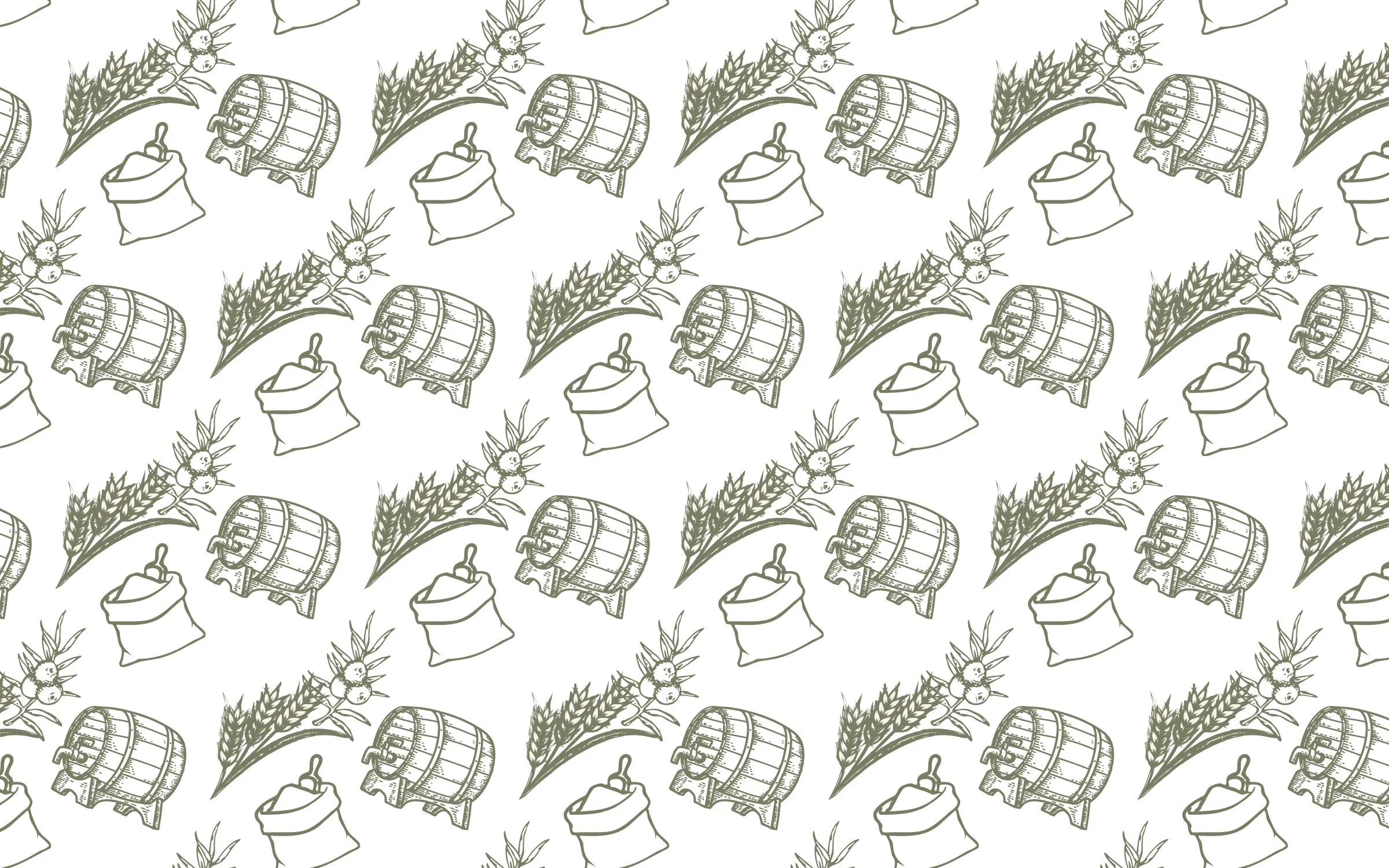
To command a $75+ retail price point, a premium spirit needs more than a great product. It needs a brand that earns its place on the shelf. The challenge here was to build an identity system strong enough to stand alongside established premium competitors while staying true to what makes Split Spirits distinct. A climate-neutral distillery rooted in the landscapes and seasons of Vermont, small by choice and purposeful by nature.
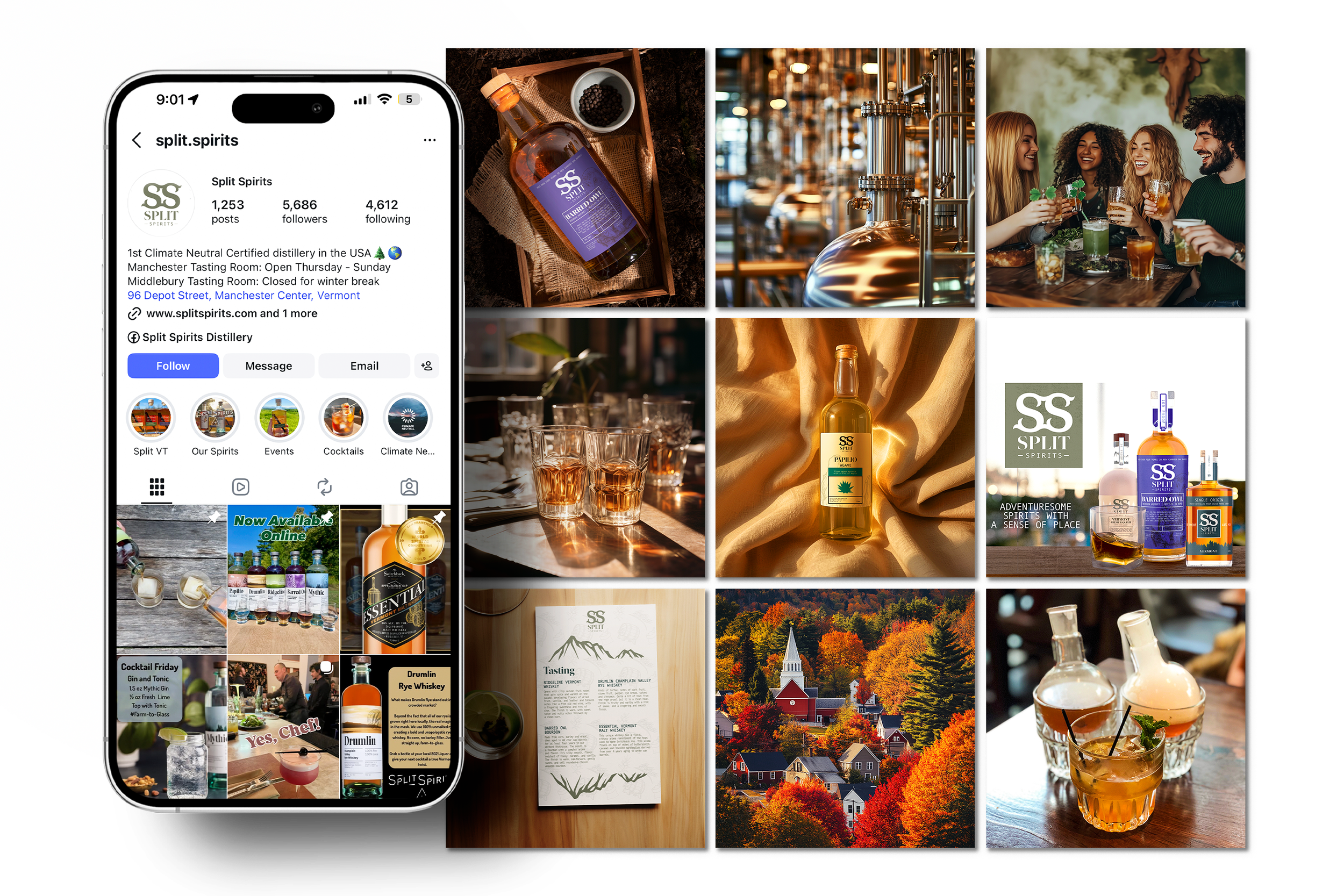
Applications
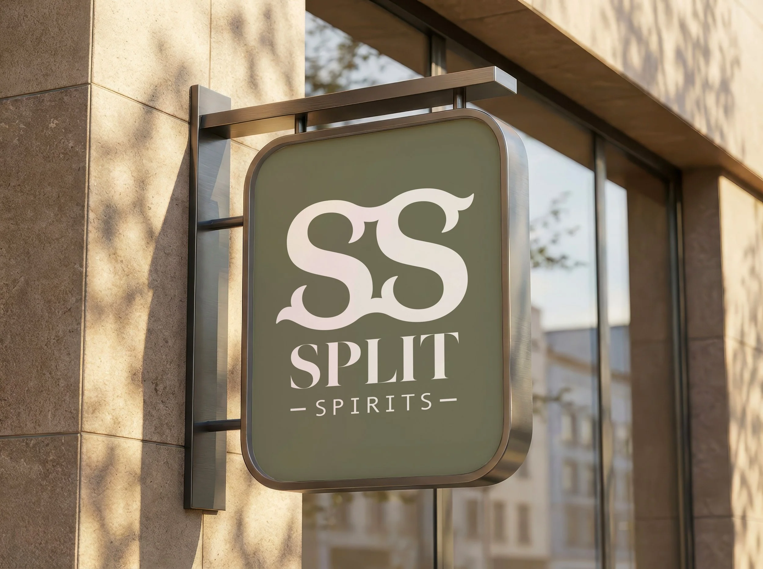
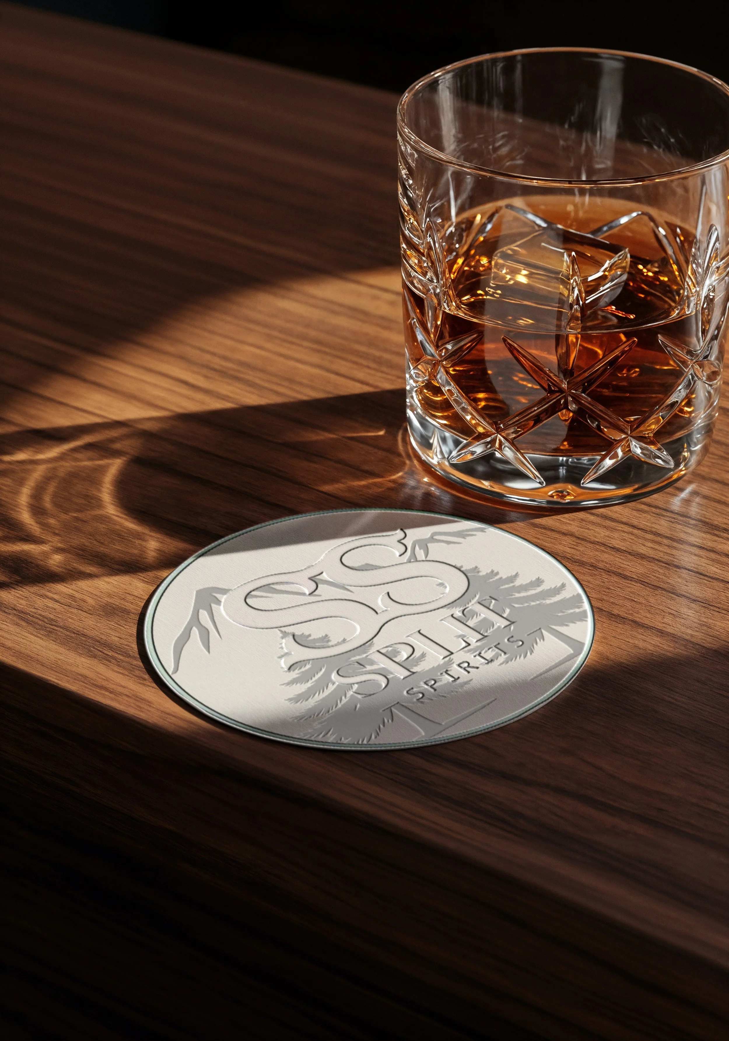
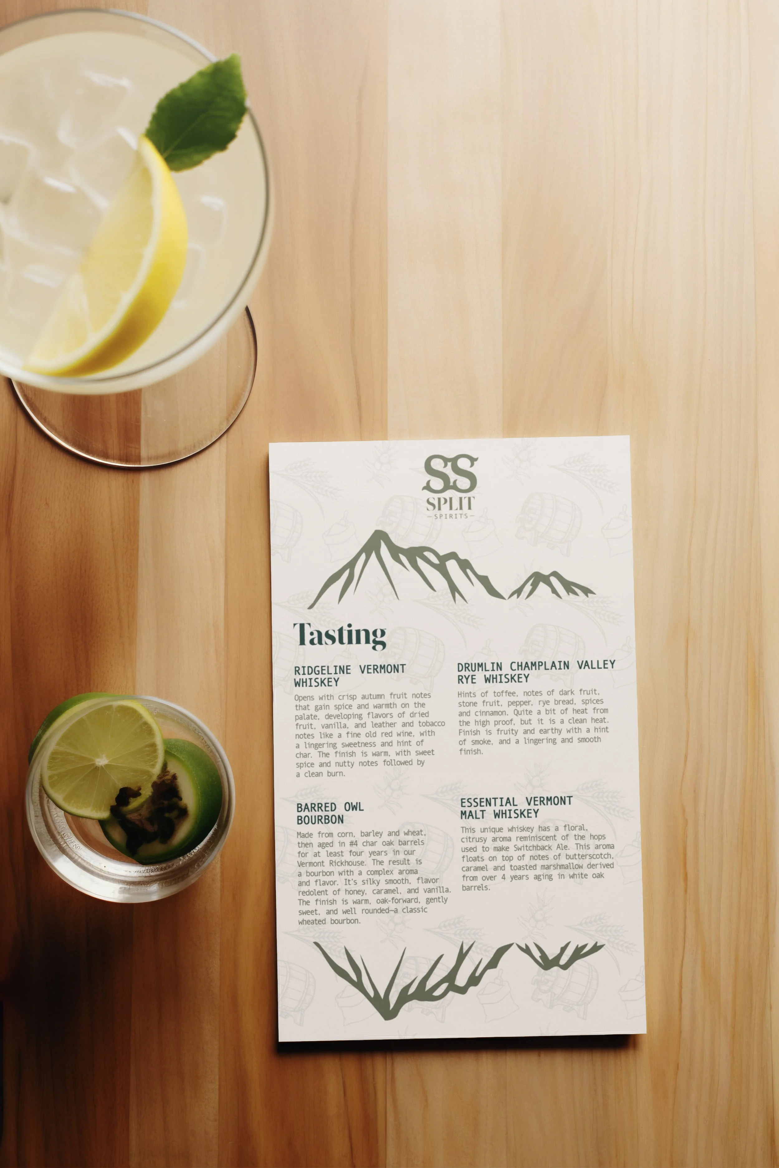
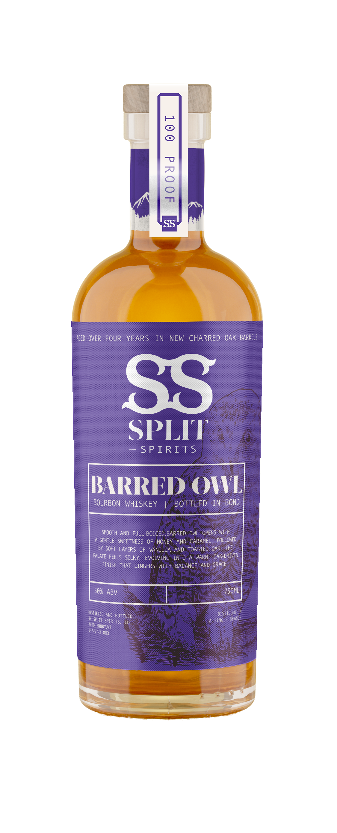
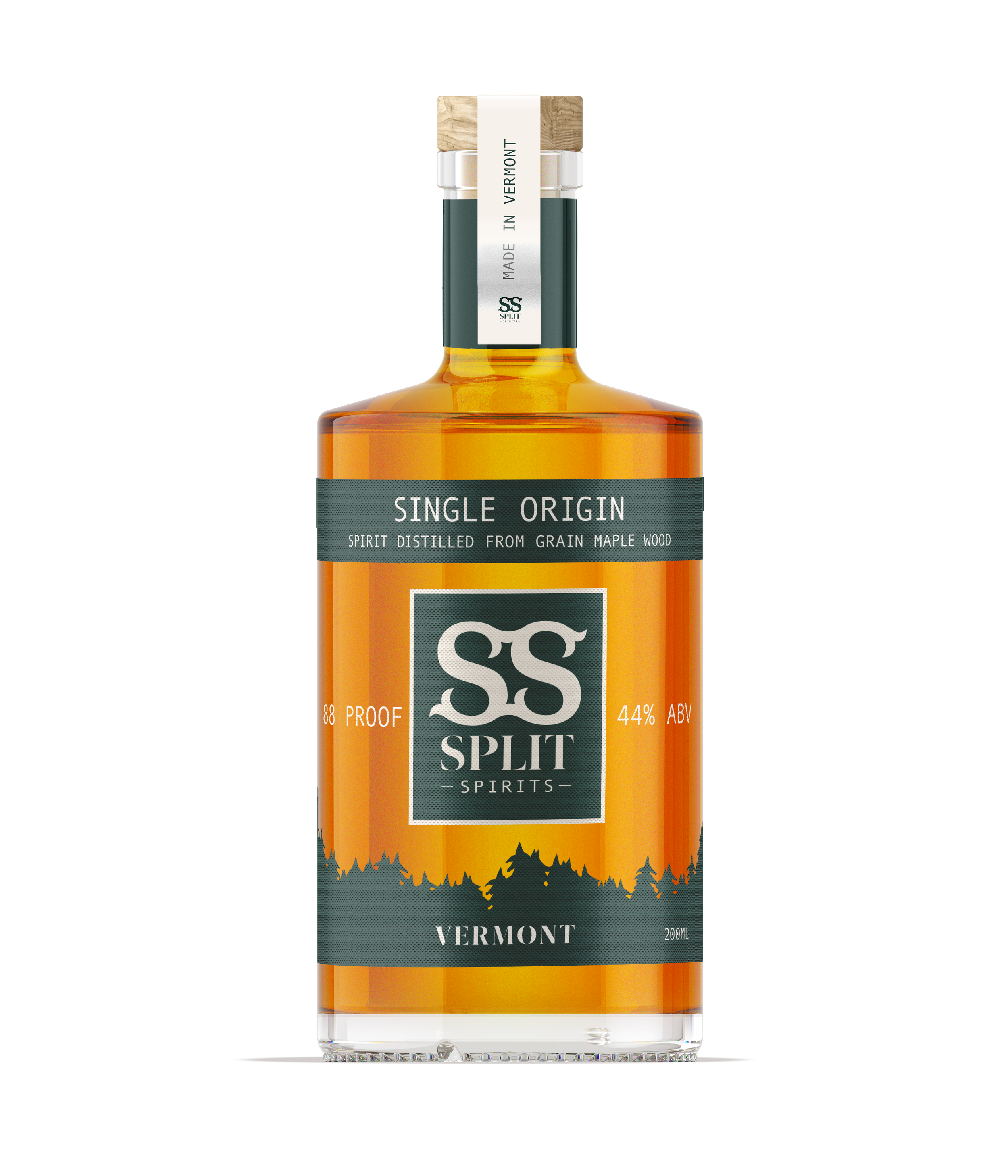
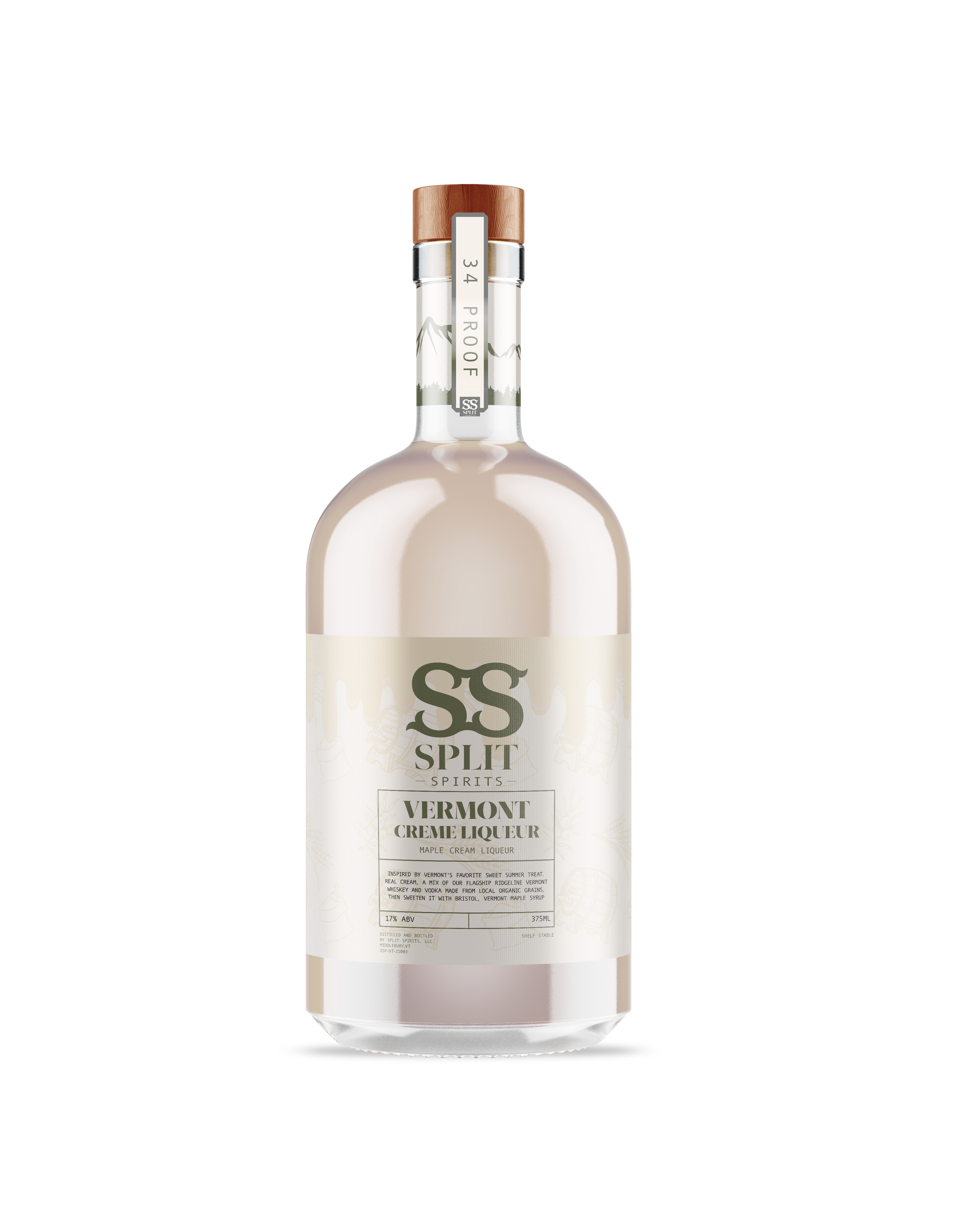
Logo
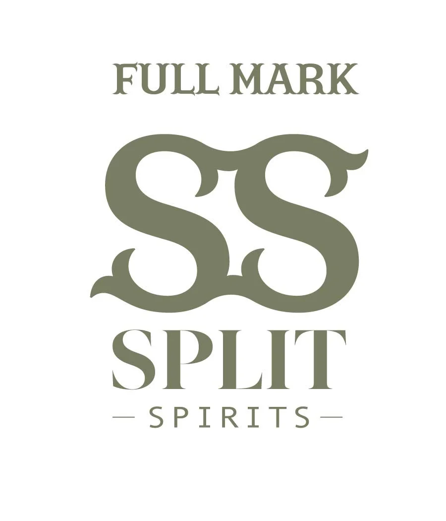
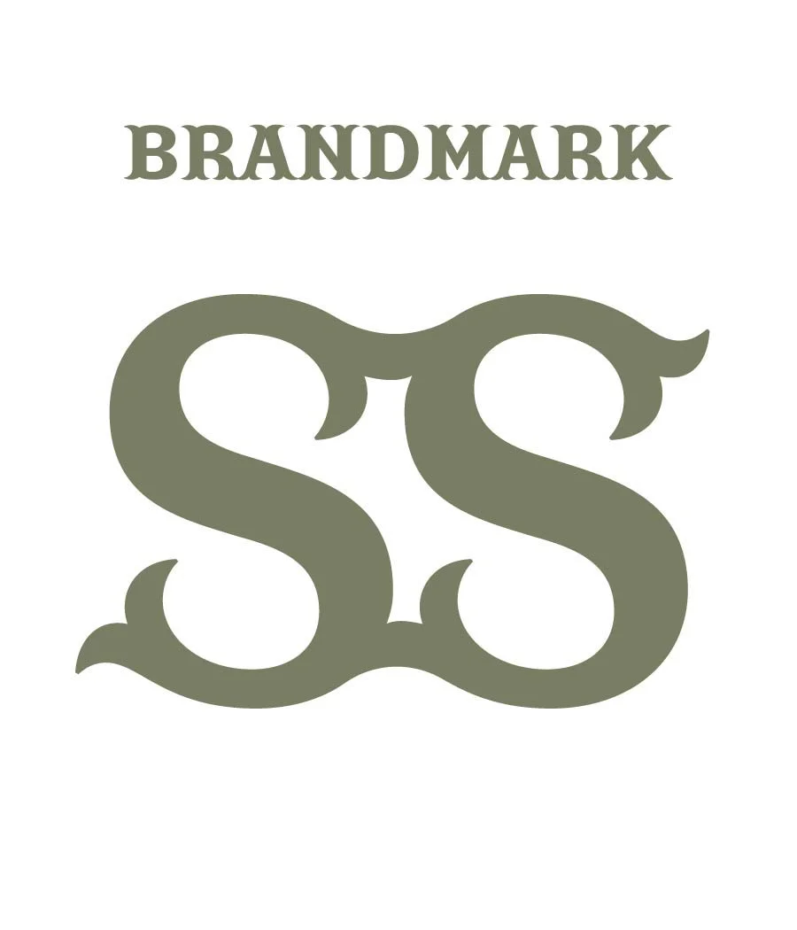
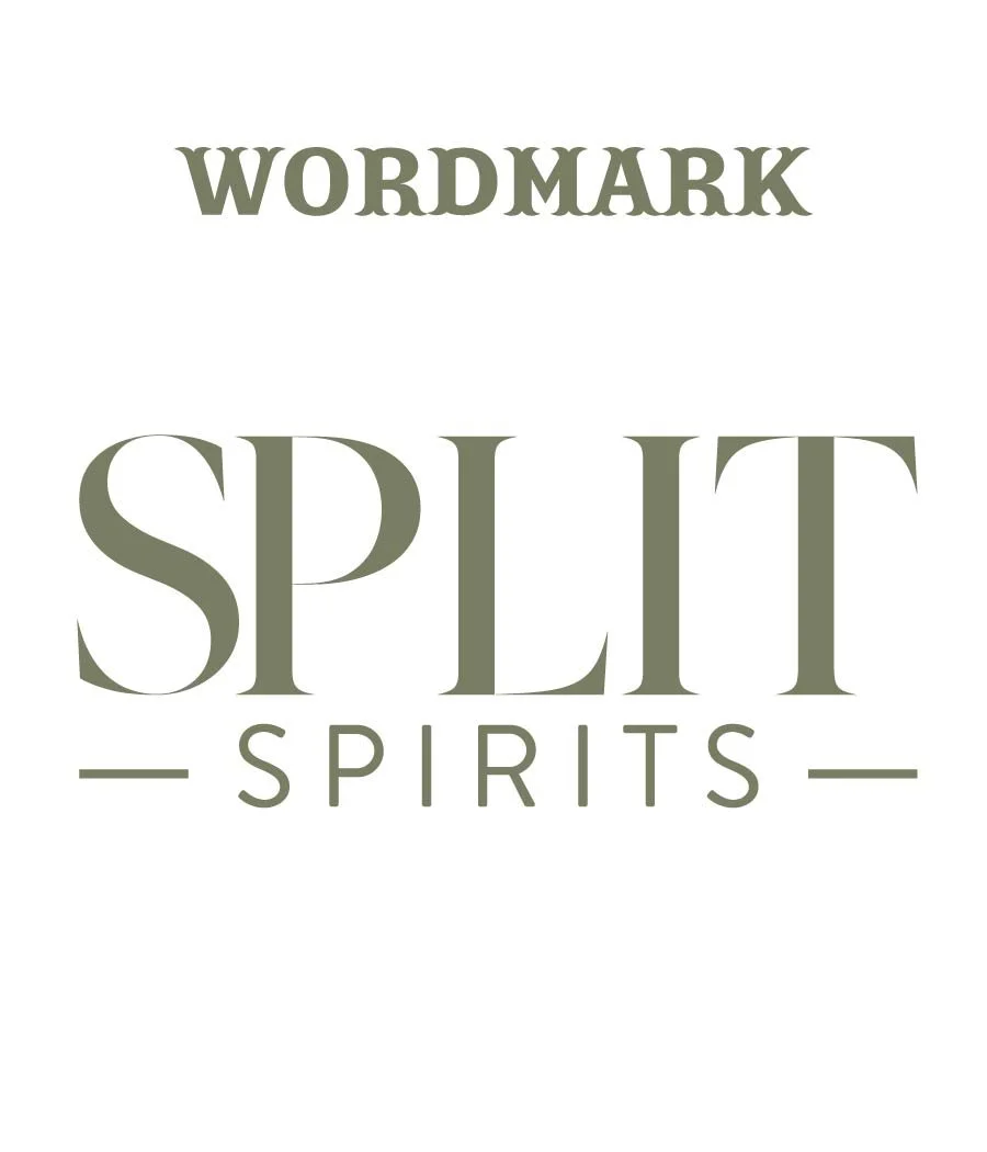
The SS monogram became the foundation of the entire identity. Two interlocking letterforms built with classic swash details that nod to the process of separating and mixing ingredients when making whiskey.
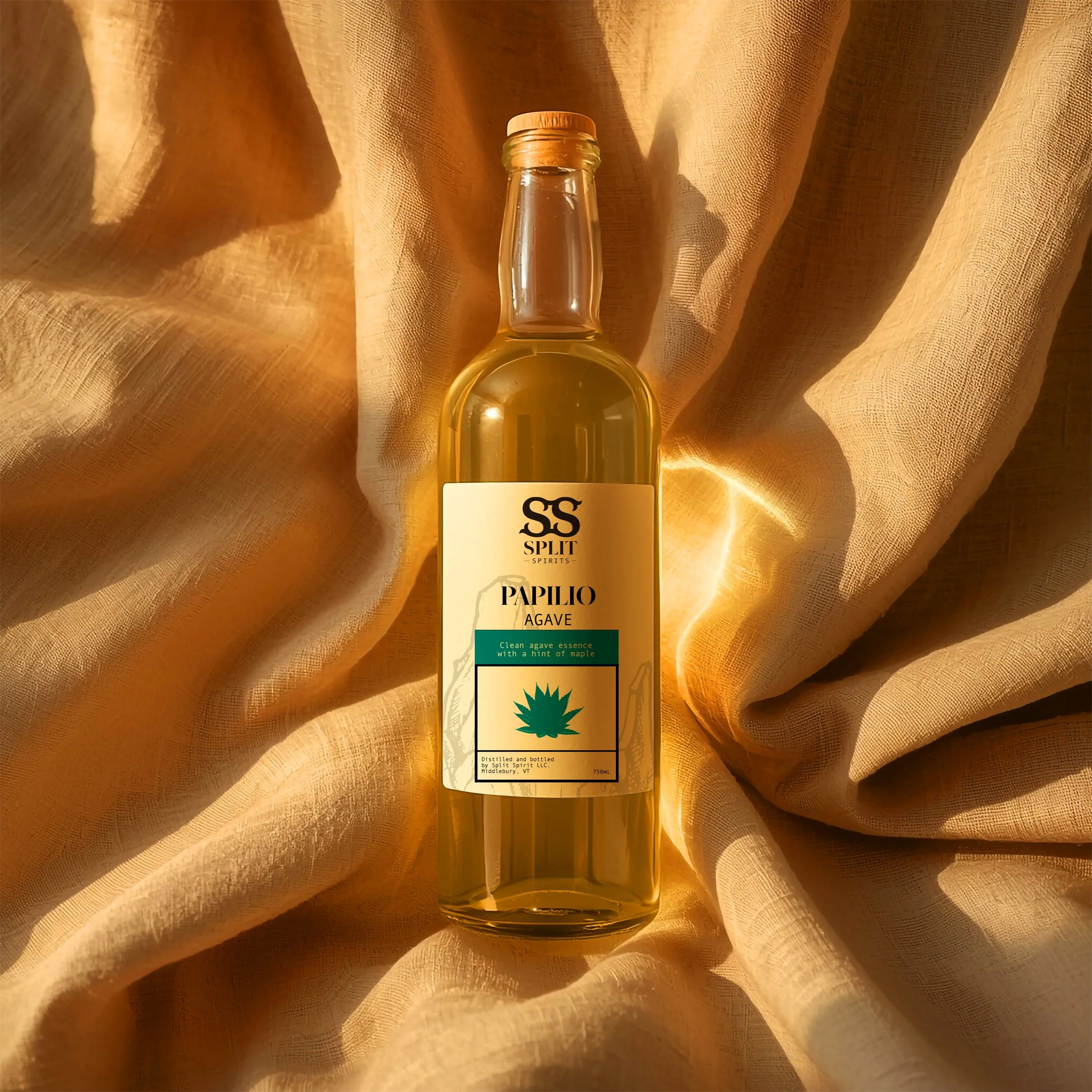
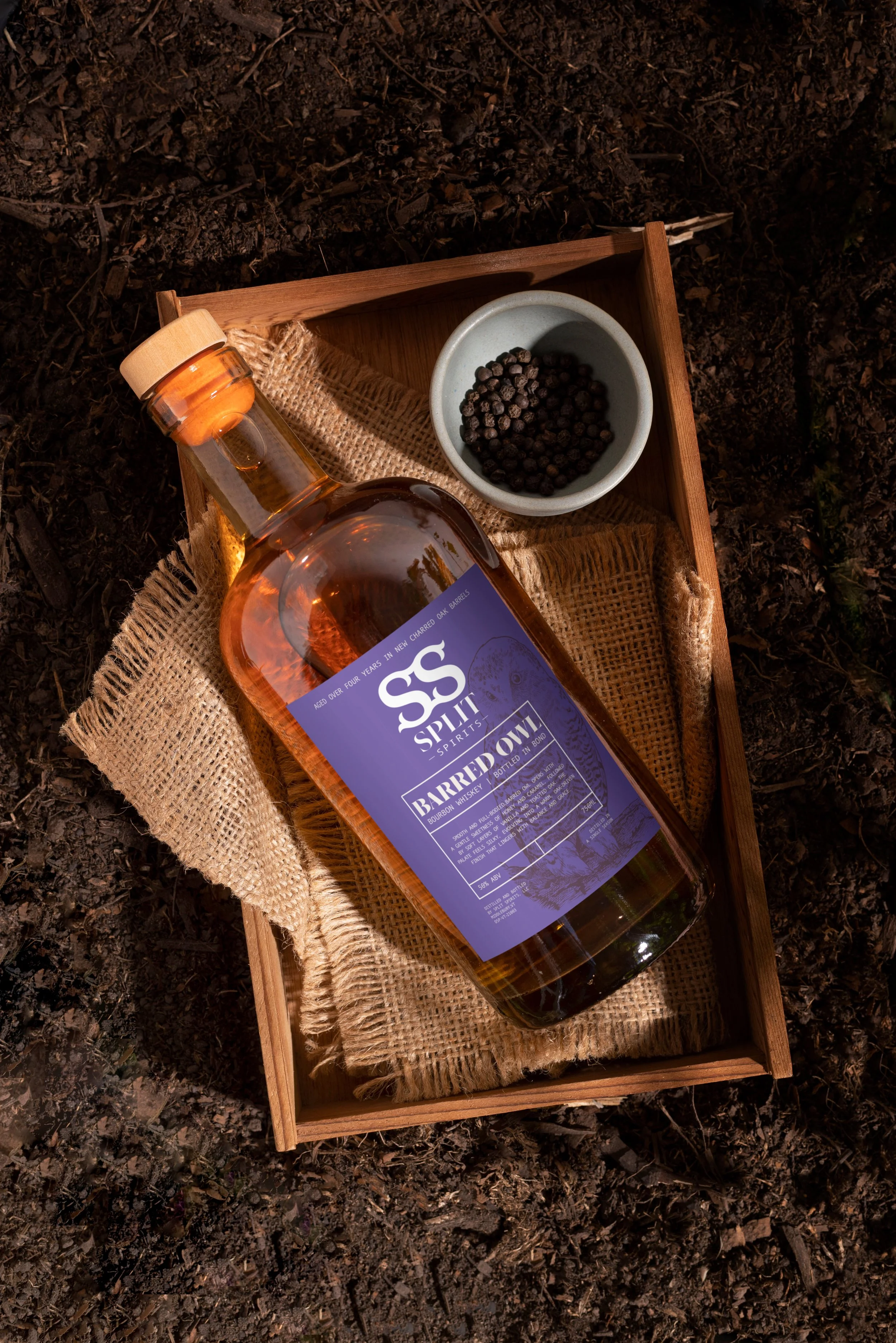
Color Palette
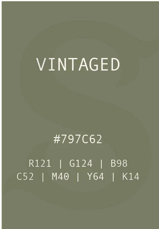
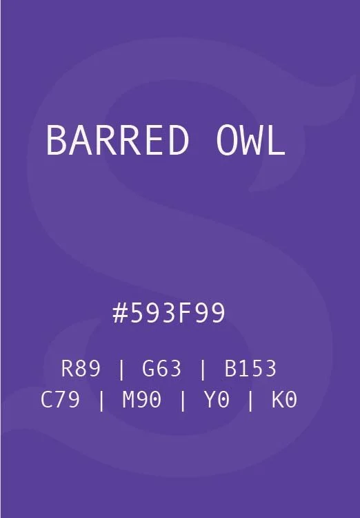
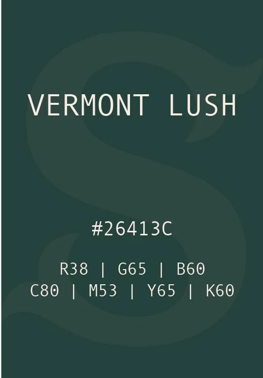
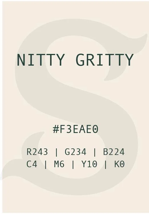
The palette was drawn directly from Vermont itself. Vintaged is the muted olive of aged barrels and forest undergrowth. Barred Owl is the rich purple of the brand's flagship whiskey label, unexpected and bold on the shelf. Vermont Lush is the deep forest green of the landscape Split Spirits calls home. Nitty Gritty is the natural cream of raw grain before it becomes something worth savoring. Every color earns its place.
Typography
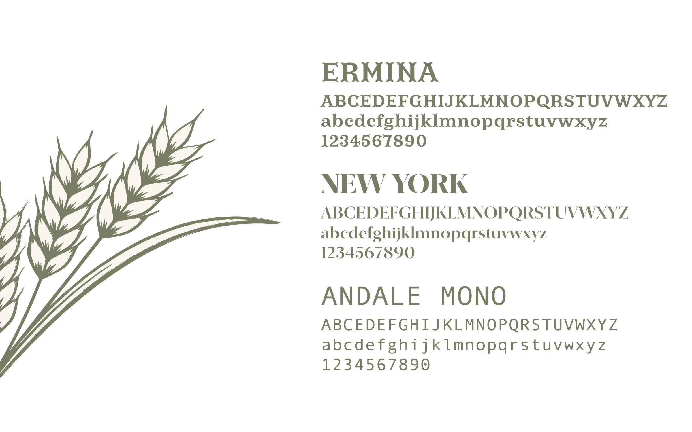
Three typefaces carry the brand's voice across every touchpoint. Ermina brings the elegance and editorial weight of a heritage brand. New York grounds the system with a refined serif that reads with authority at any size. Andale Mono adds a technical, craft driven precision to supporting text and label details. Together they create a typographic hierarchy that feels premium without feeling cold
Other