Branding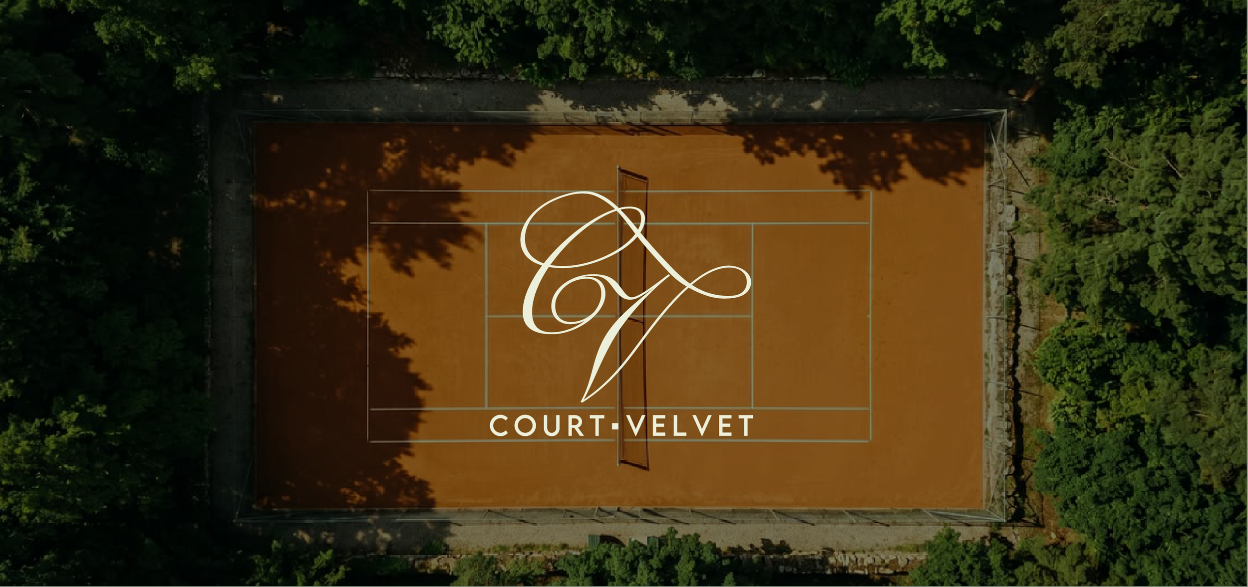
Services
Brand Identity
Roles
Designer
Overview
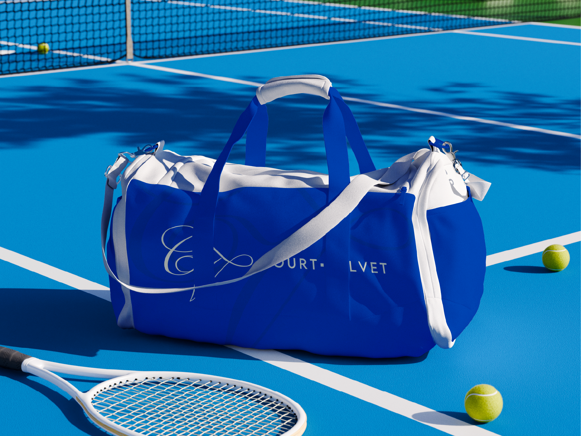
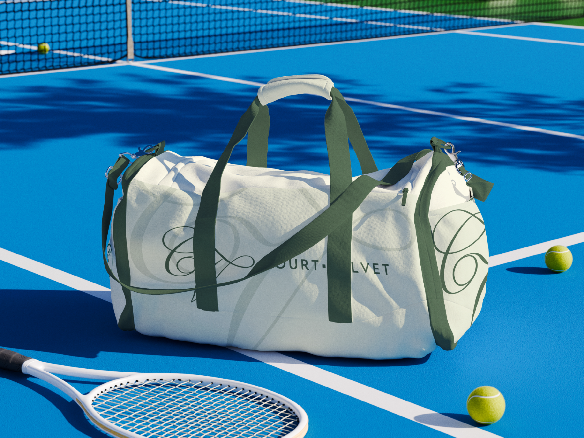
Court Velvet is a brand identity for a tennis club whose name was already in the sport's vocabulary. The brand's foundation comes from the velvet touch, a phrase commentators use to describe finesse at its highest: the soft volley, the drop shot, the player who absorbs pace and returns the ball as placement. The identity draws further inspiration from motions and environment. The pile of velvet and the felt of a tennis ball share more than a surface, both with nap, both with direction, both rewarding a careful hand.
Logo
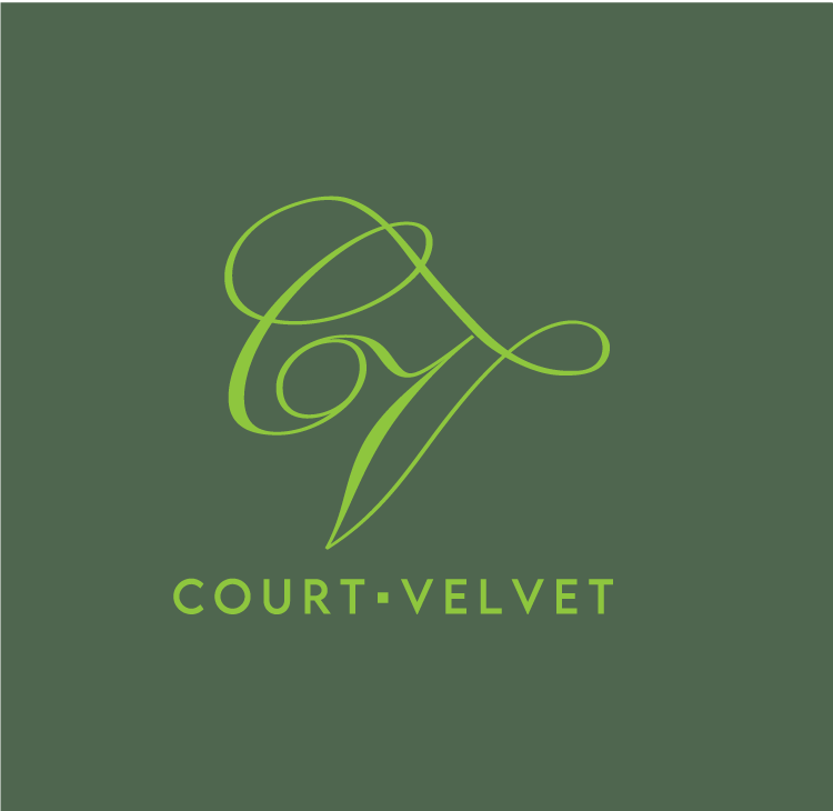
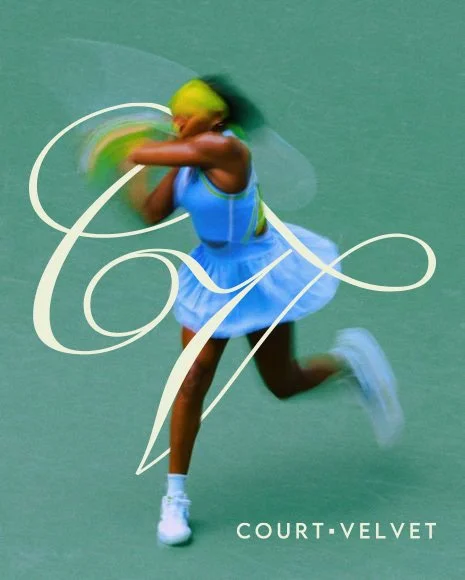
The logo carries this thinking into motion. The CV is drawn as the swing itself, the arc a racket cuts through the air as it meets the ball. It makes the invisible visible, giving form to the sensation of contact. Court Velvet is designed for tennis lovers across every register: the enthusiast, the improver, the regular, the devotee. It stands for tennis as craft and tennis as community, a place where status, leisure, social life, and serious play meet under one roof, joined by a shared love of the game.
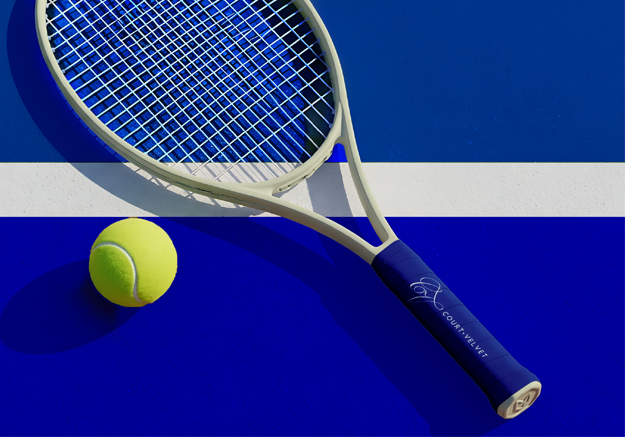
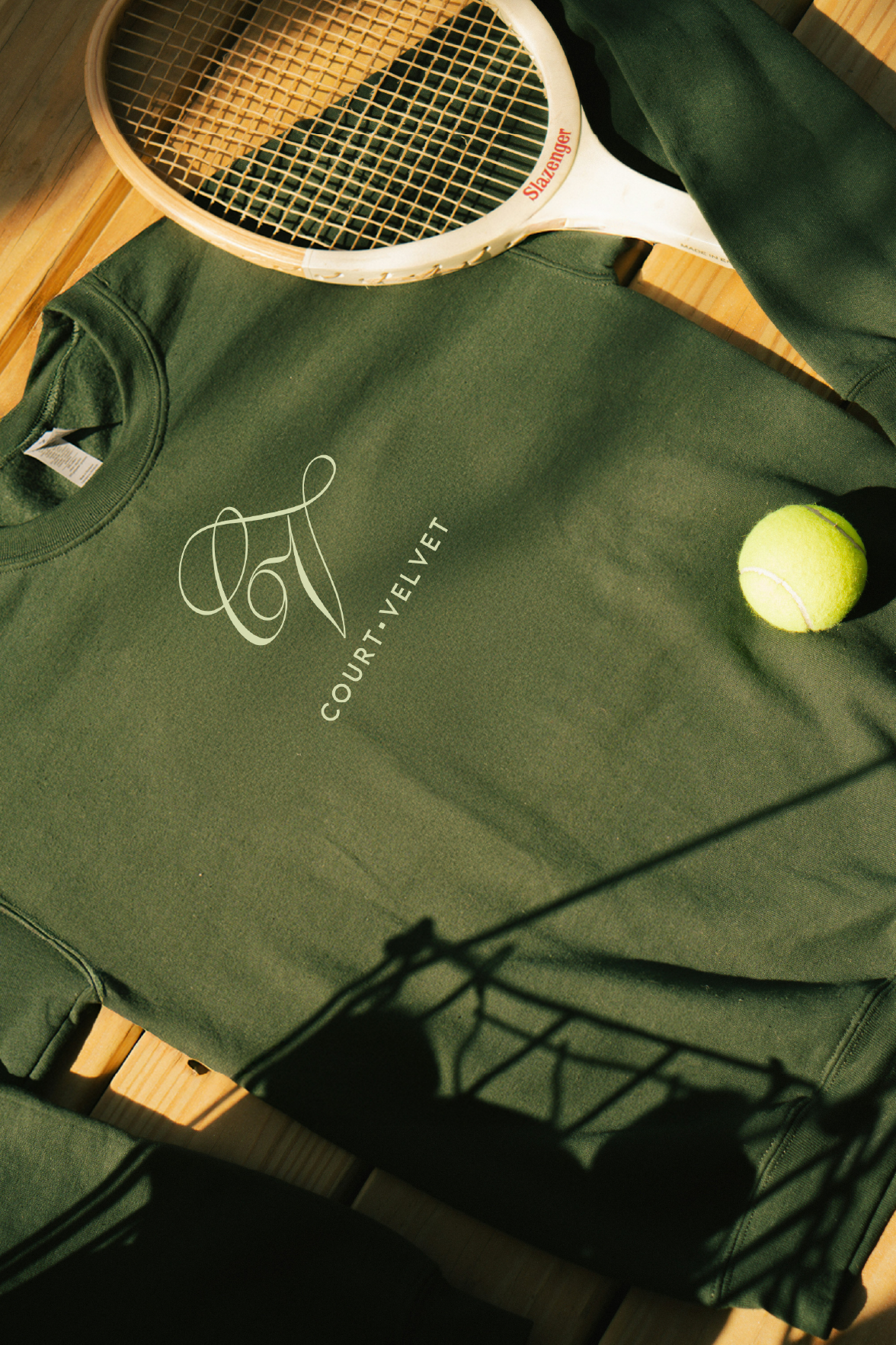
The visual identity translates this thinking into a complete system. The CV monogram is illustrated as a single calligraphic line, its curves shaped by the arc of a tennis swing rather than the geometry of a letterform, so the mark reads as both signature and gesture.


Typography

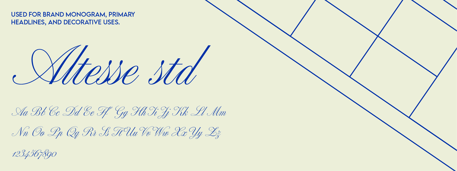
Tennis has deep roots in France, originating as a handball game called jeu de paume in the 12th century. Before Britain modernized the sport in 1874, France gave it its soul. The typographic choices for Court Velvet pay homage to that origin. Altesse Std brings the elegance and fluidity of French script to the brand's primary headlines and monogram. Lemon Milk Regular grounds the system with clean geometric precision, used across the wordmark, body text, and captions.
Color Palette
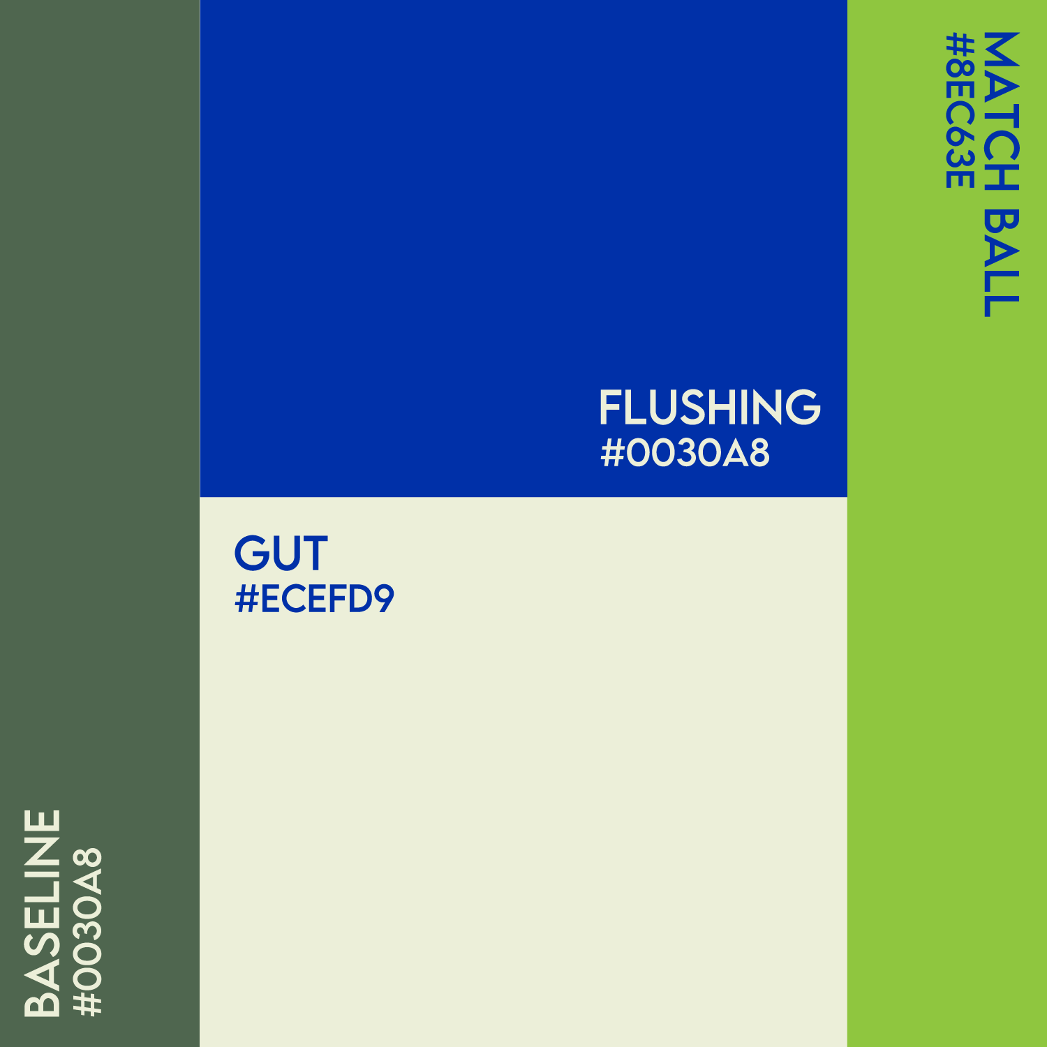
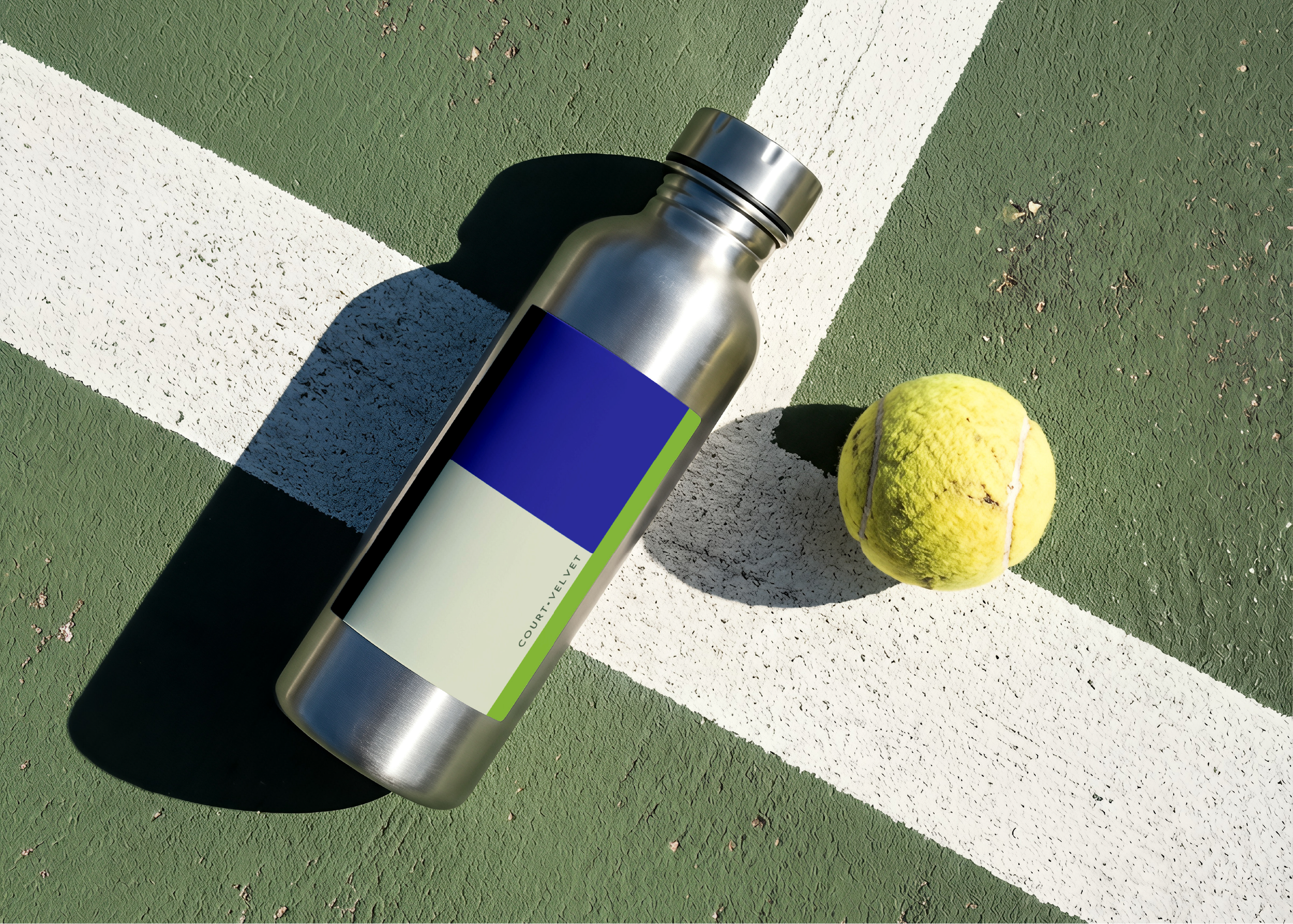
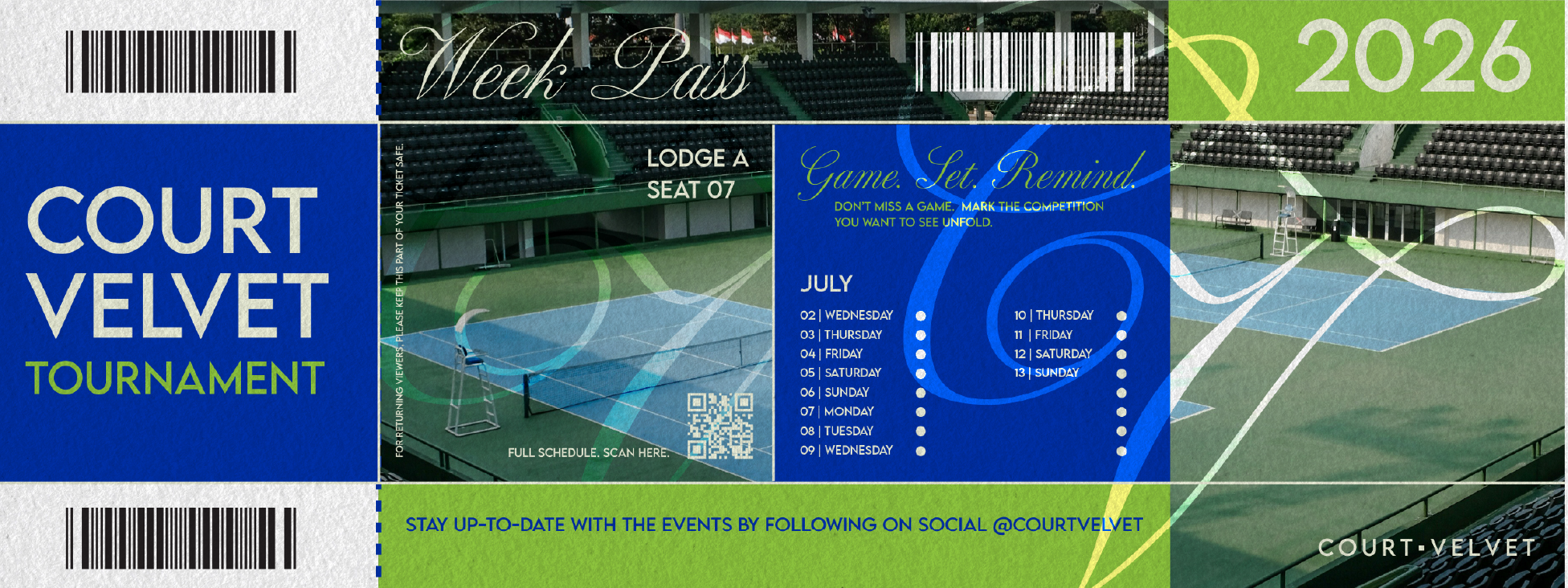
The palette was pulled from the court itself. Flushing is the bold royal blue of hard courts under stadium lights. Baseline is the deep forest green of grass courts and traditional club culture. Match Ball is the electric lime that lives at the edge of every rally. Gut is the natural cream of racket strings and vintage court attire. Every color has a reason to be here
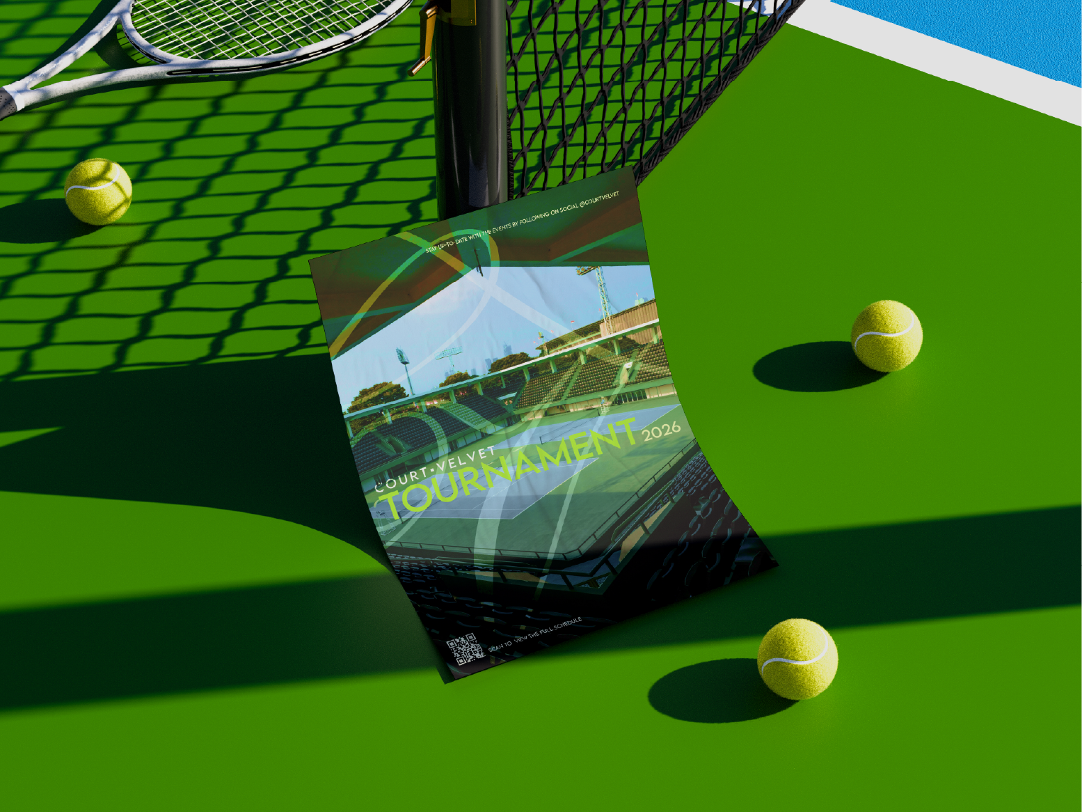
Poster Series
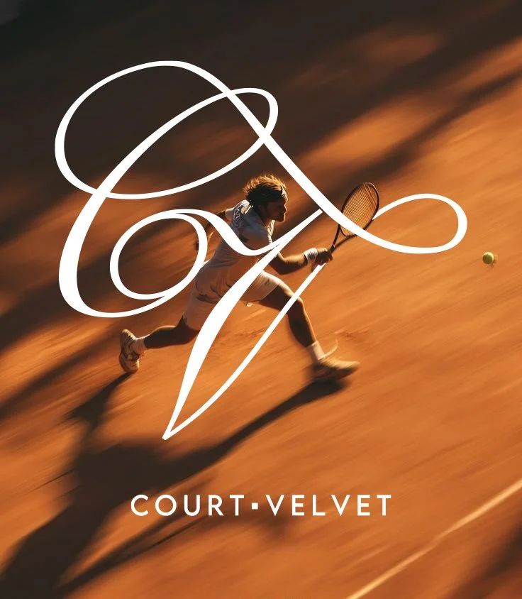
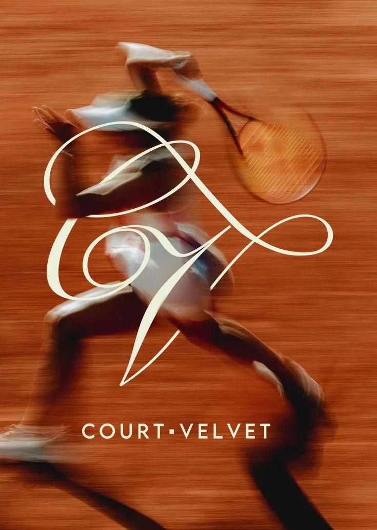
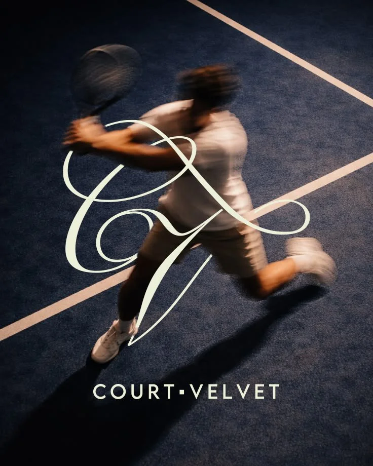
A poster series built around a single idea. Every player has a signature. A shot they return to, a motion that is entirely their own. Each composition pairs a player mid-swing with the CV monogram drawn directly over their gesture, making visible the feeling that exists in the fraction of a second between racket and ball. Court Velvet is the place where that signature is found, refined, and celebrated
Visualize the Invisible
The ticket and program layouts draw directly from the geometry of the court itself. The grid that defines fair play on the court becomes the structure that organizes information on the page.

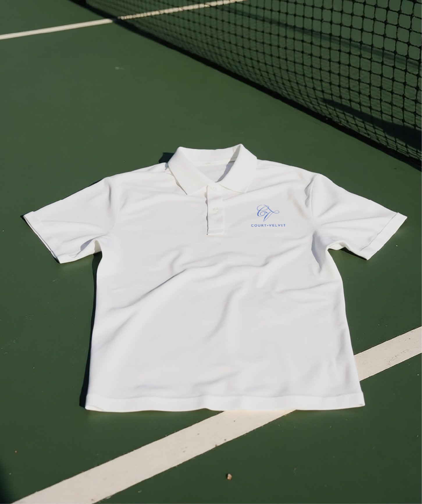
Apparel
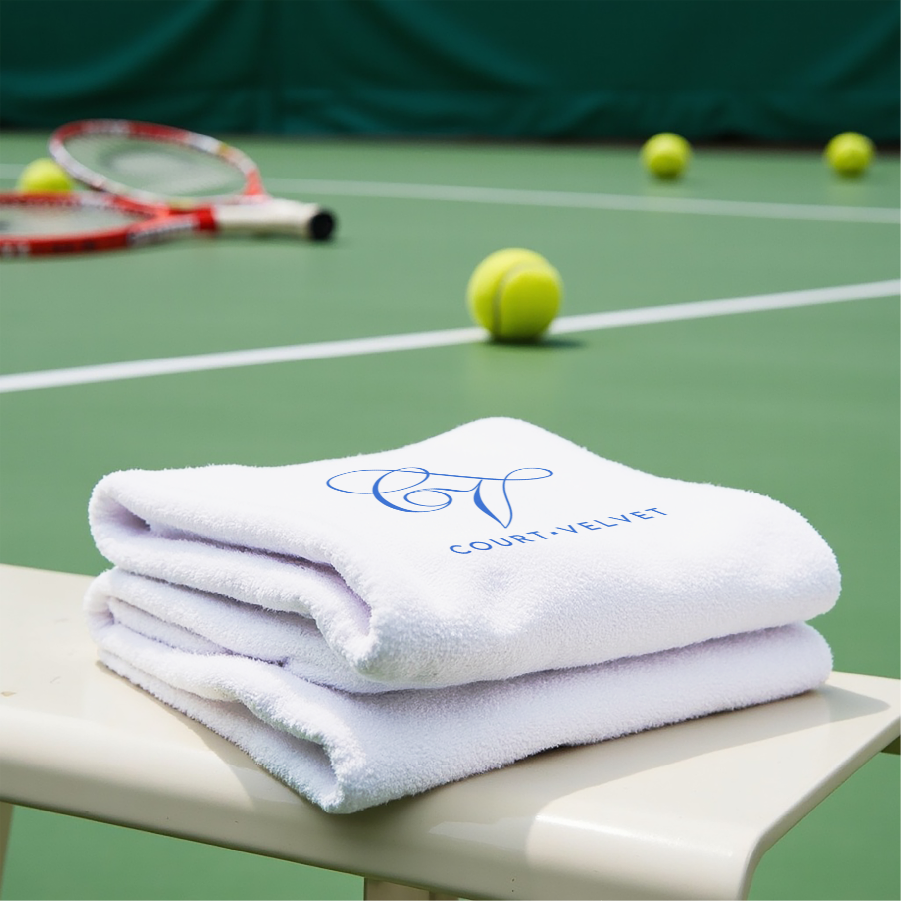
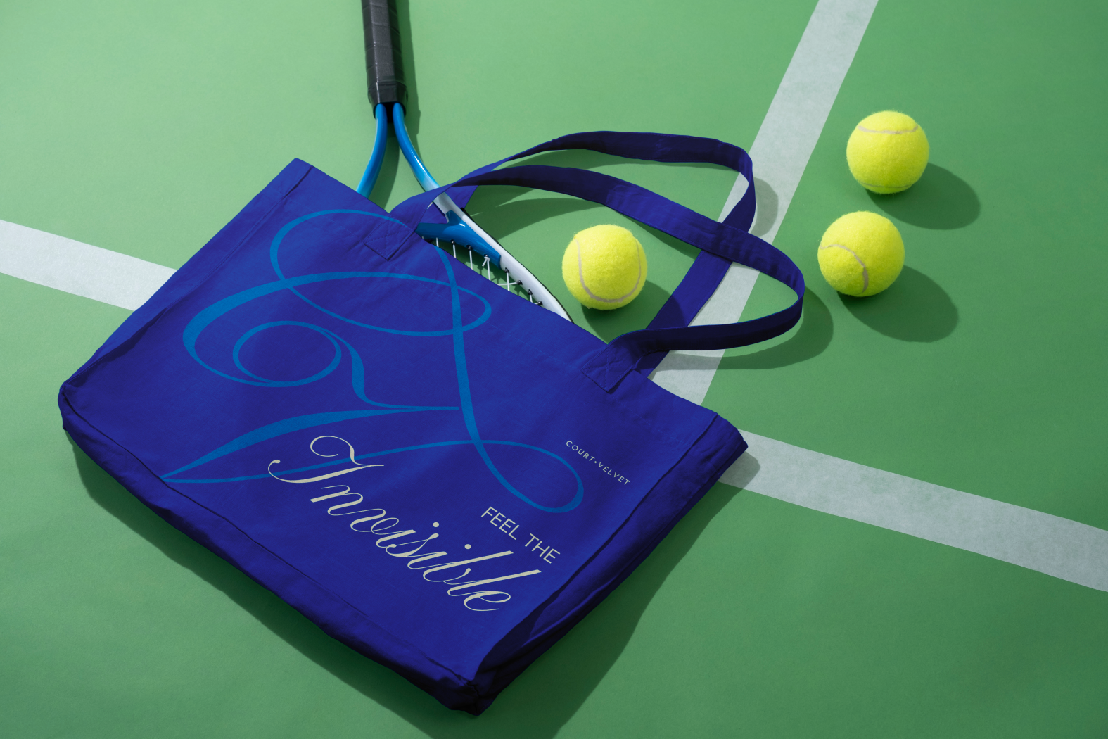
Gears