RebrandingServices
Rebrand | Copywrite | Illustration
Roles
Designer | Copywriter | Illustrator
Overview
Mansfield Animal Shelter has always been more than a place where animals wait. It is a place where lives turn around for the animals who find safety within its walls, and for the people who walk through its doors. This rebranding project is about making sure the world outside those doors knows that too.
This is not just a visual refresh. It is a deliberate, community-rooted effort to reintroduce Mansfield Animal Shelter as a living, breathing part of the Mansfield community, one that needs its neighbors not just as visitors, but as advocates, foster families, donors, and partners.
Goal
The goal is to give the shelter the foundation it needs to show up consistently across every touchpoint. Mansfield Animal Shelter aims to expand the foster network, increase shelter visits, and build a sustainable presence that makes it easier for individuals, businesses, and organizations to show up. Every animal deserves a home. Every community deserves a shelter it is proud of. This project exists to close the gap between those two truths.
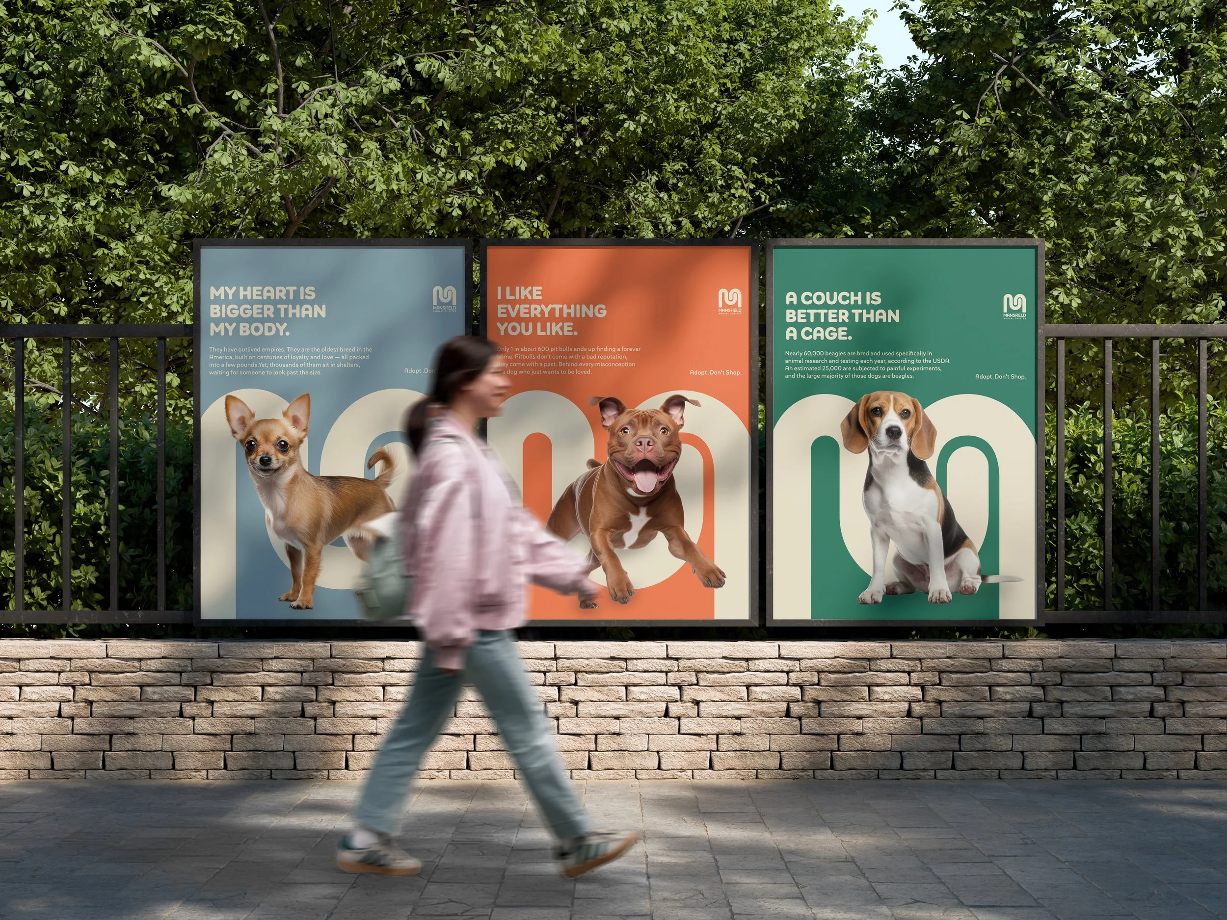
Approach
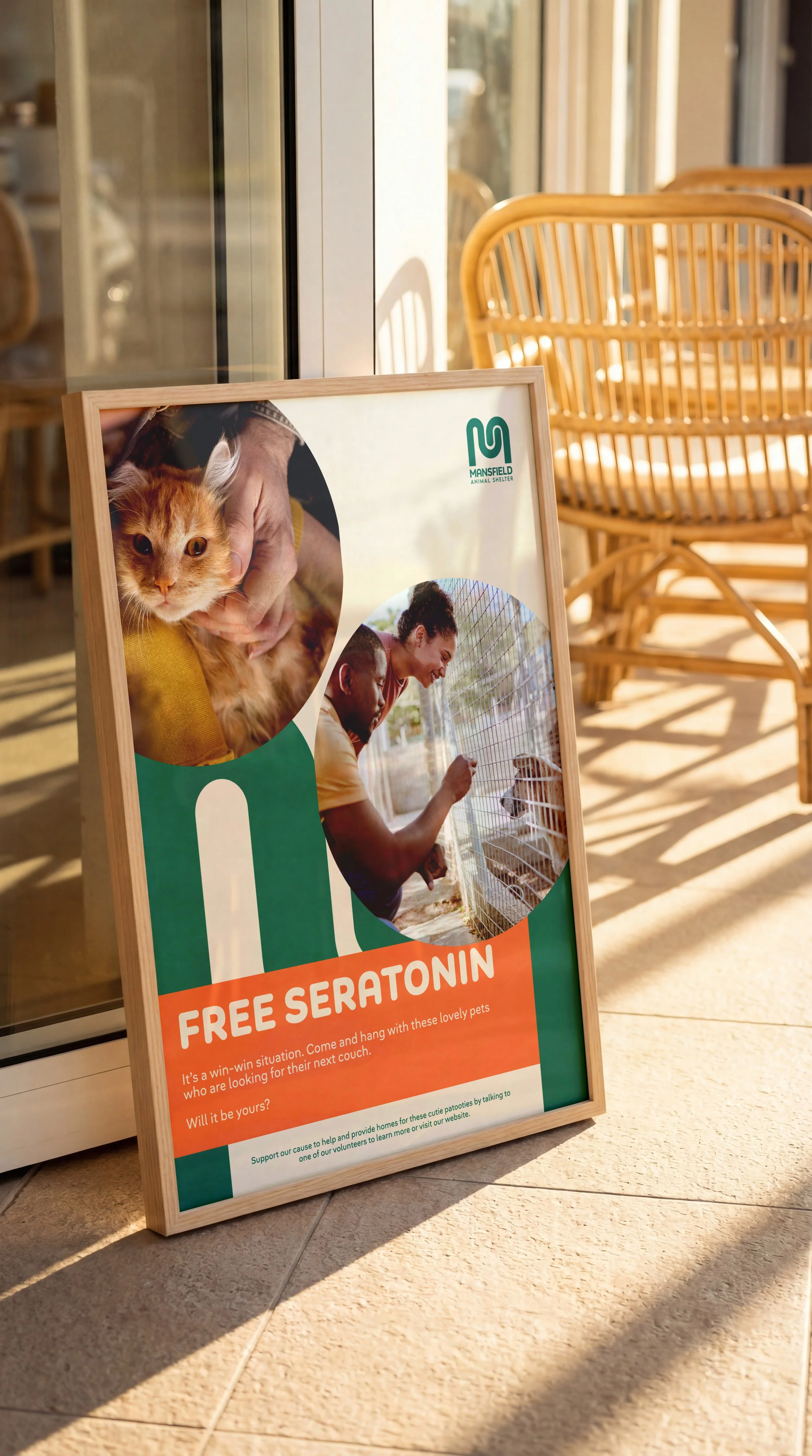
A brand refresh rooted in warmth, clarity, and community. From there, we build outward. Targeted campaigns will speak directly to potential foster families, breaking down barriers and misconceptions that keep good people on the sidelines. Community partnerships will create visibility in places where trust already exists: local businesses, schools, events, and organizations. Finally, we establish the infrastructure for giving — making it simple, compelling, and meaningful for donors and sponsors to invest in the shelter's mission. Not as charity. But as a community ownership.
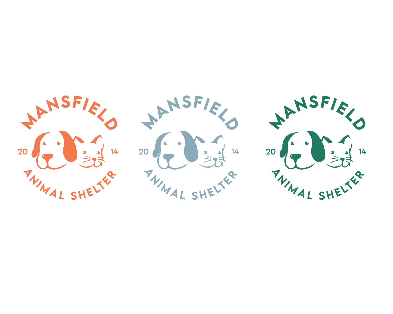
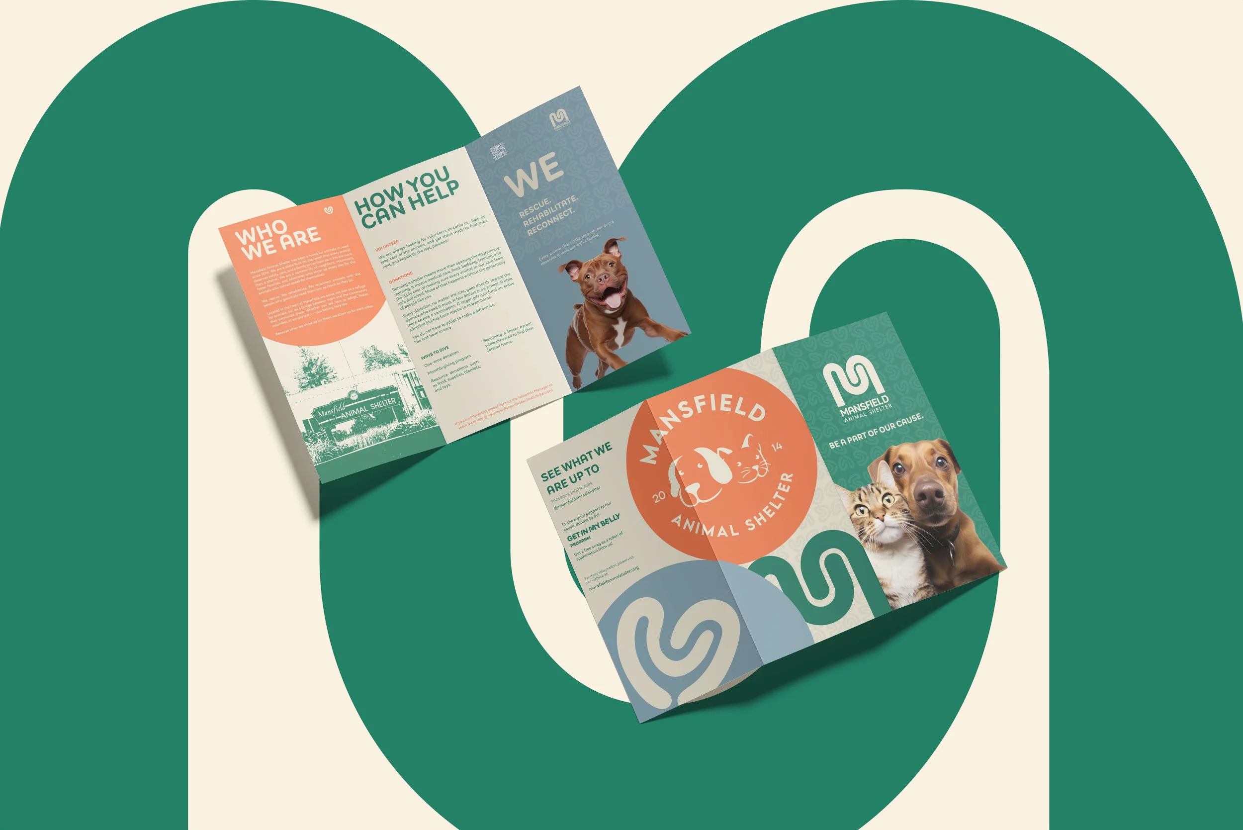
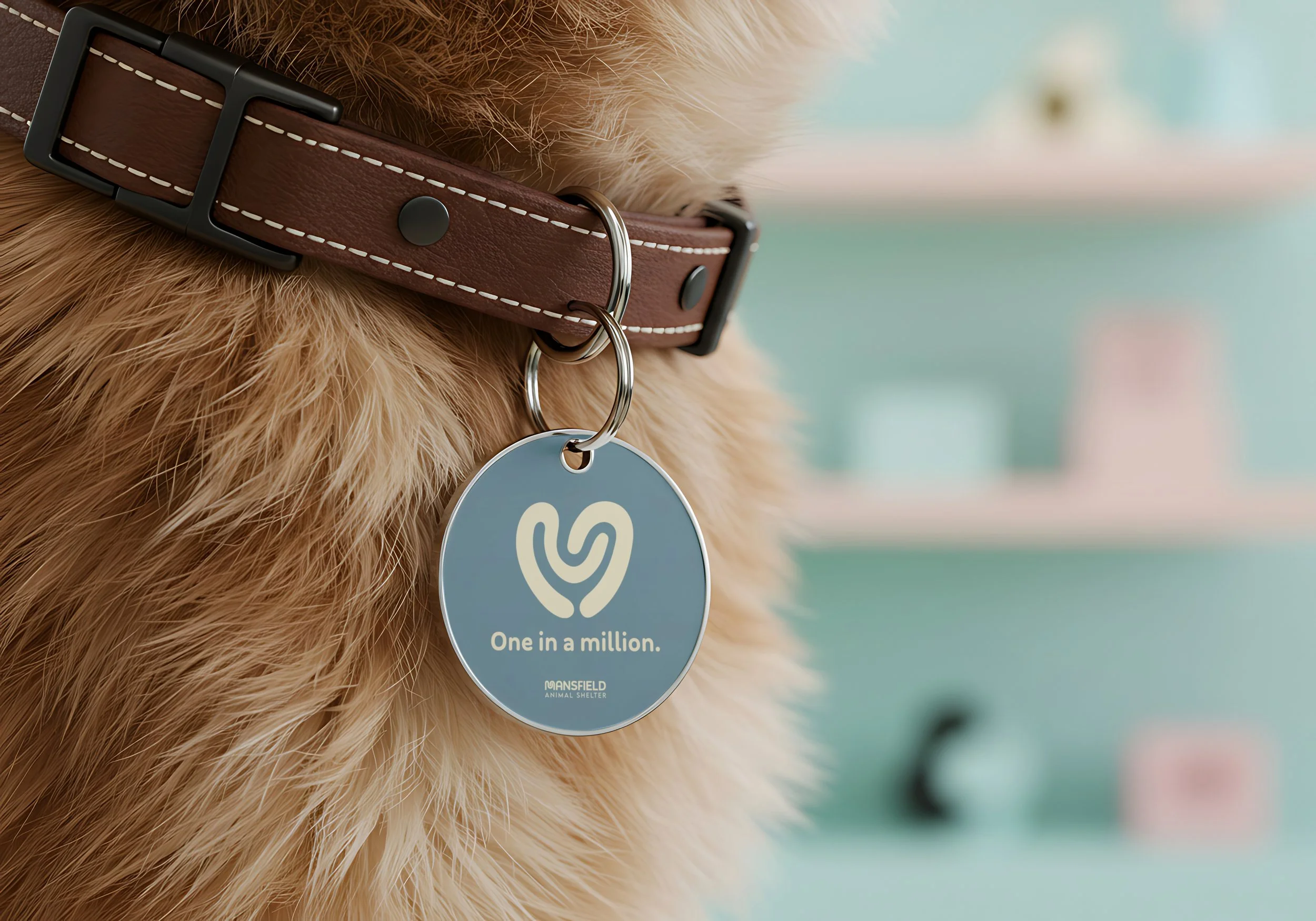
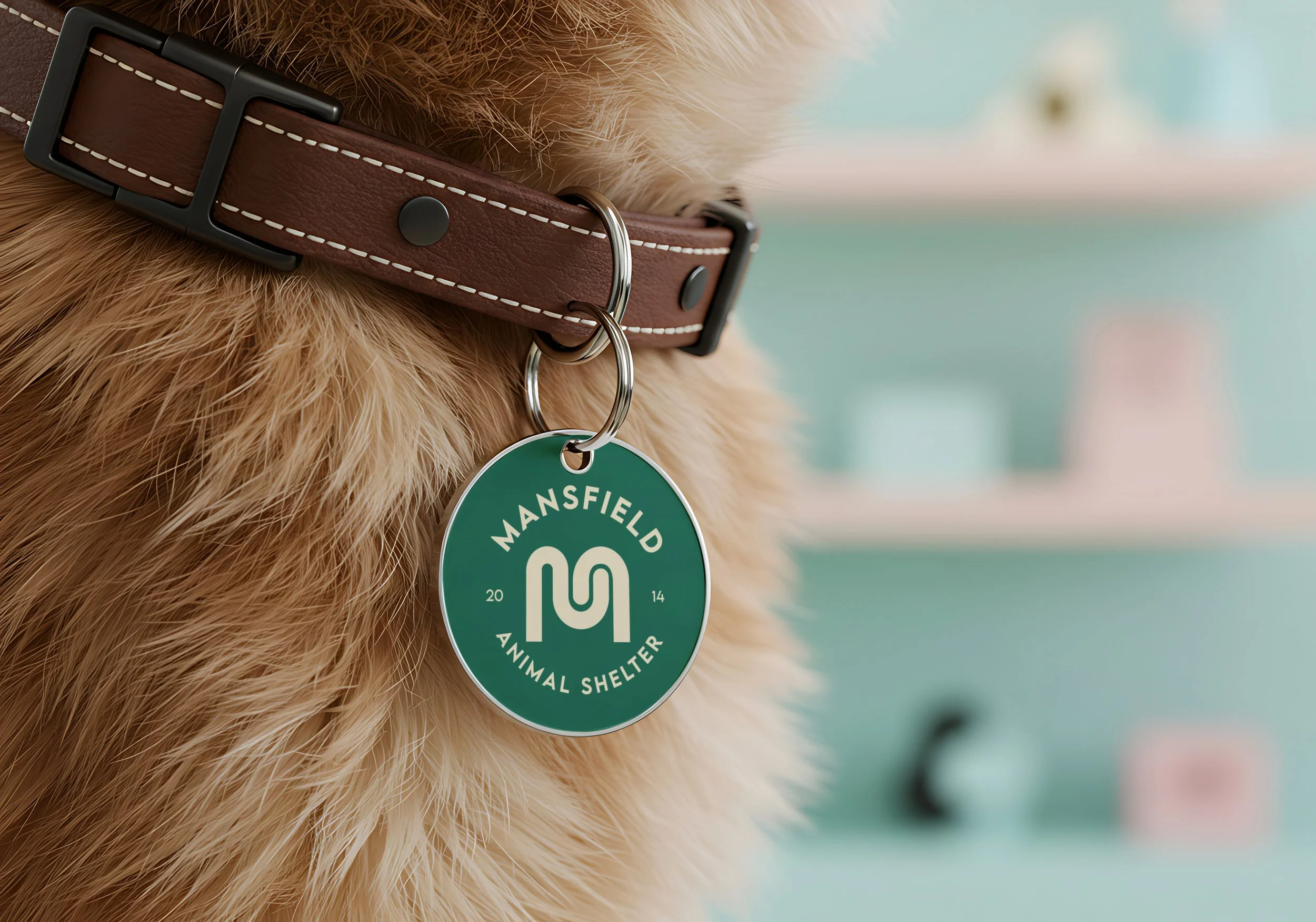
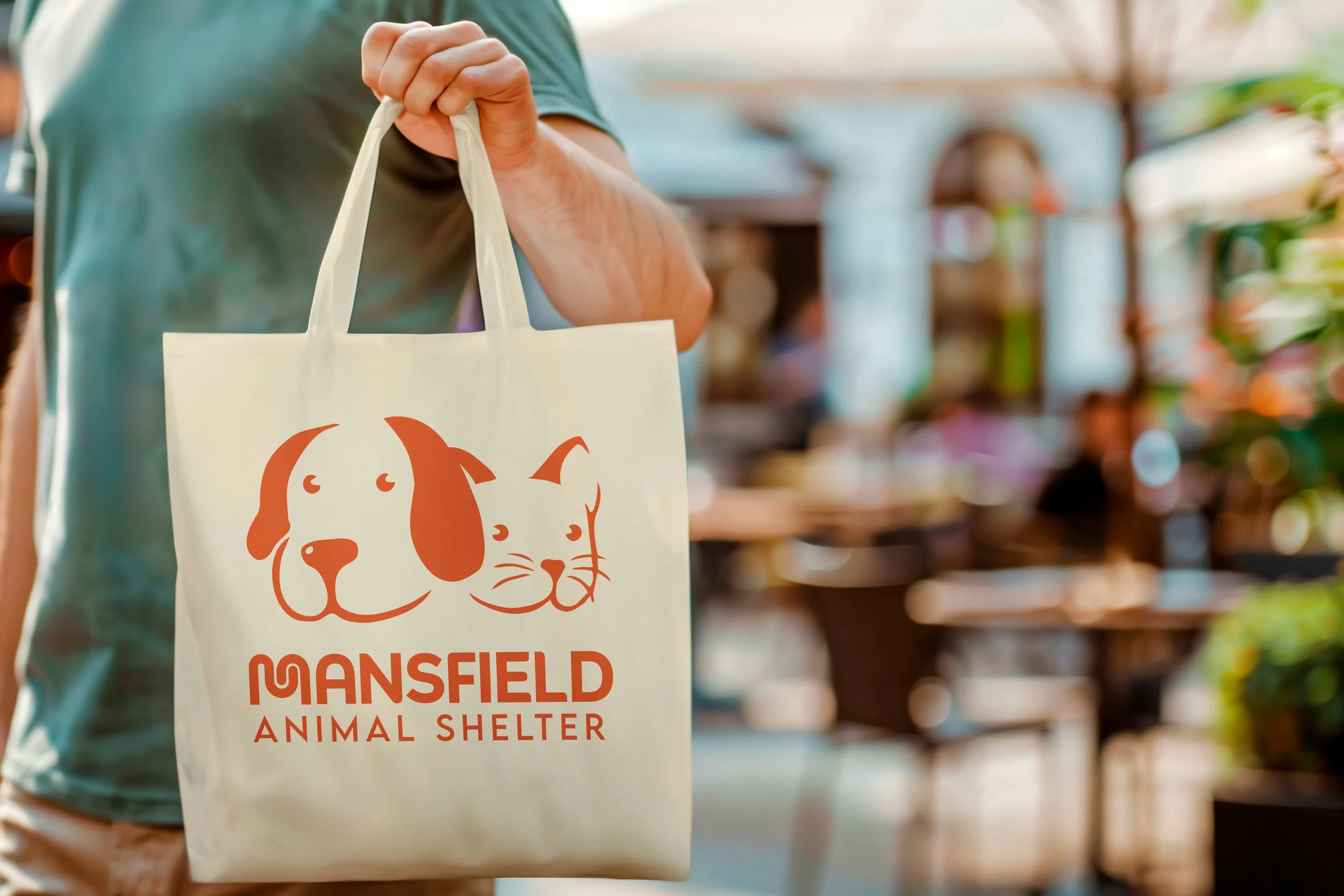
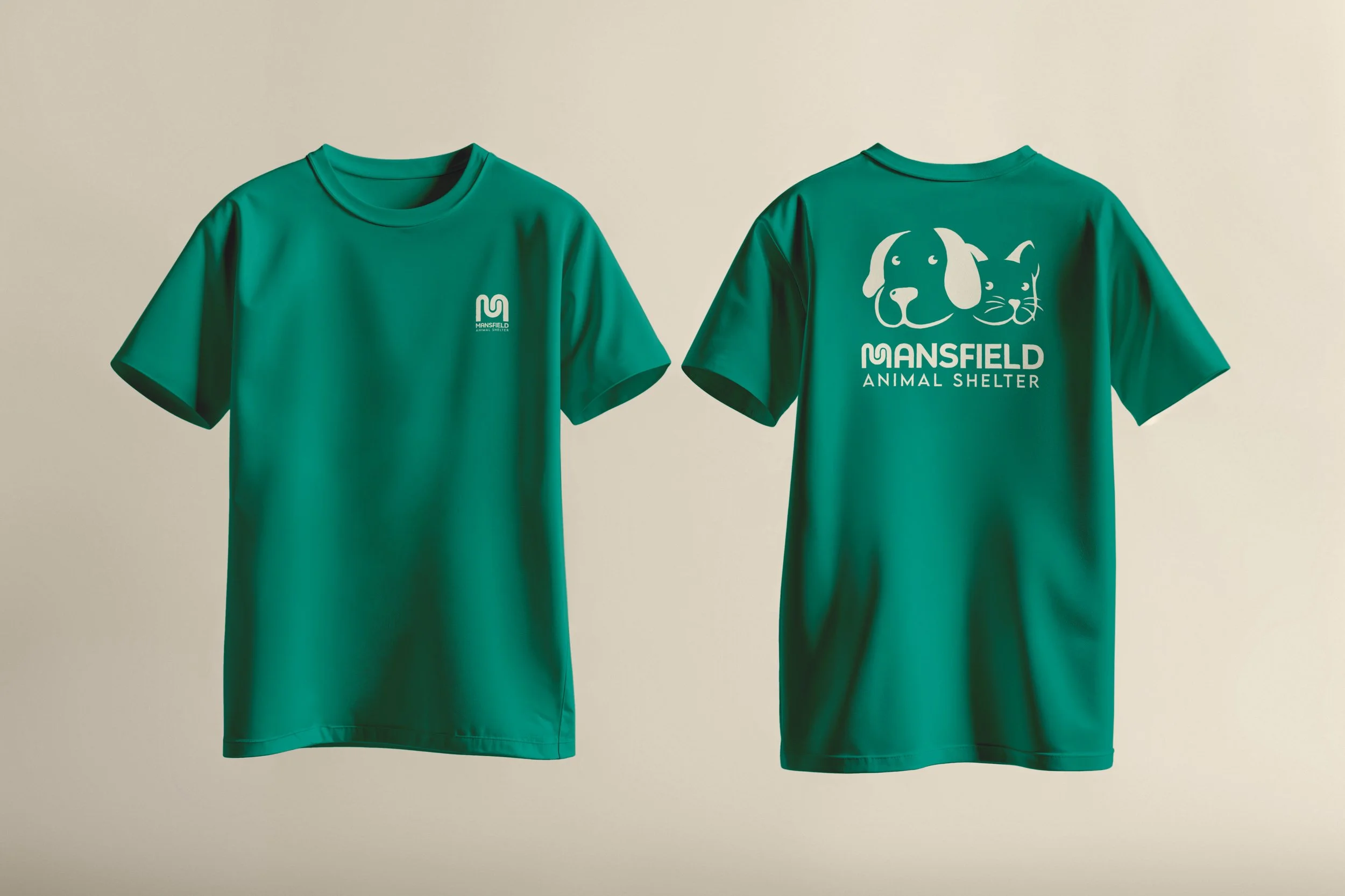
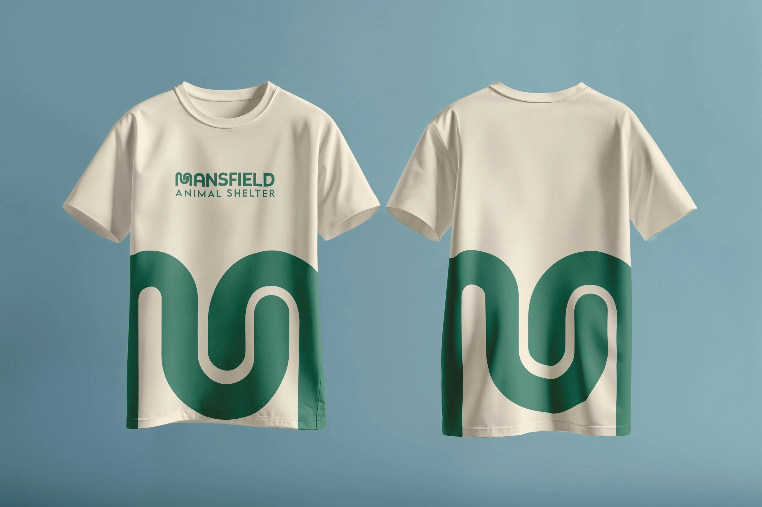
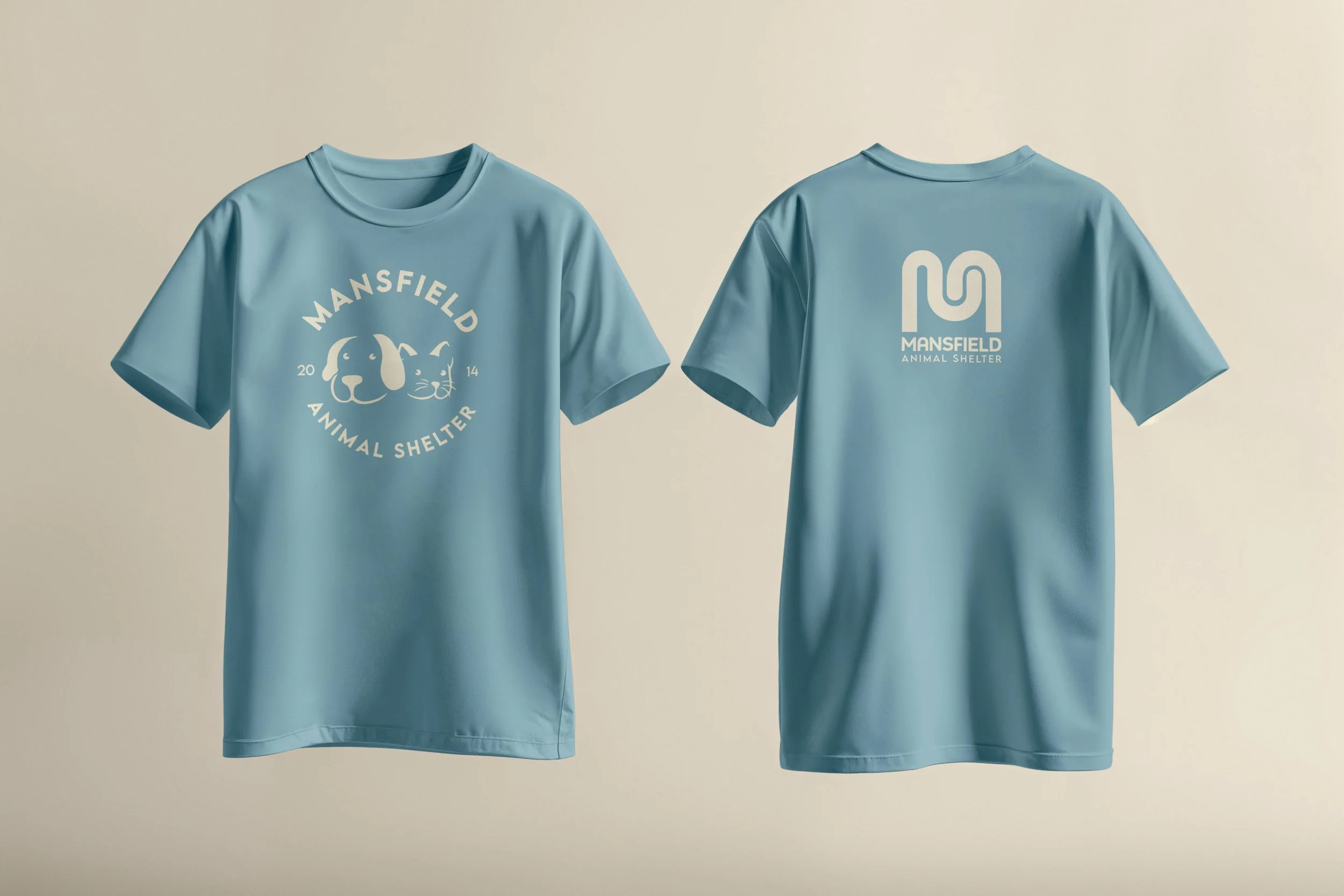
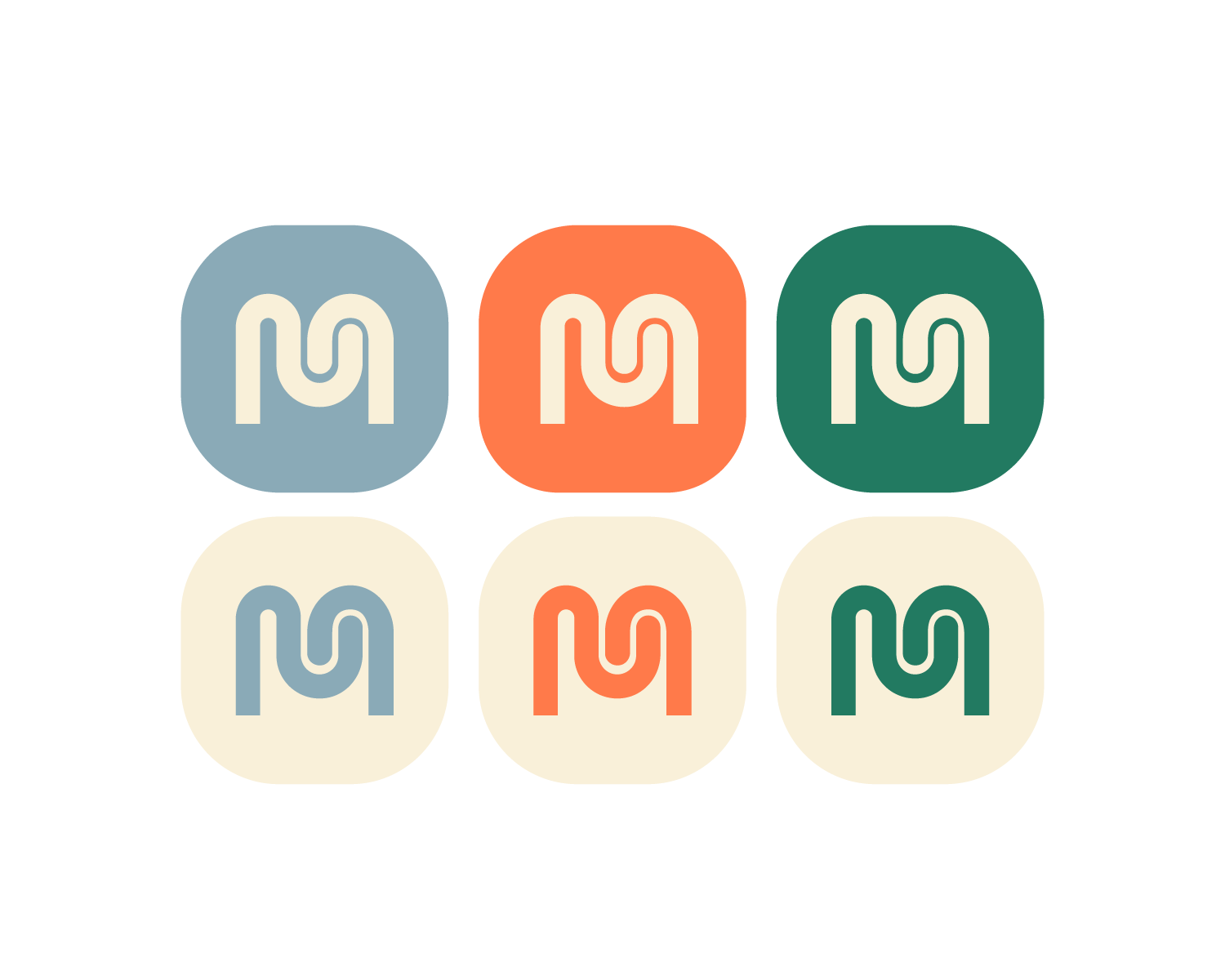
Logo Identity
A customized letter form of the letter ‘M’ that is inspired by wagging tails, a universal symbol of a happy pet. The mark works in its full lockup alongside the wordmark, as an icon, and as a repeating pattern, giving the brand flexibility across every surface while keeping that core emotion at the center. The typeface used for the rest of the text has been customized to create a balance and to add a unique touch specific to Mansfield.
PRIMARY LOGO, VERTICAL LOCKUP
PRIMARY LOGO, HORIZONTAL LOCKUP
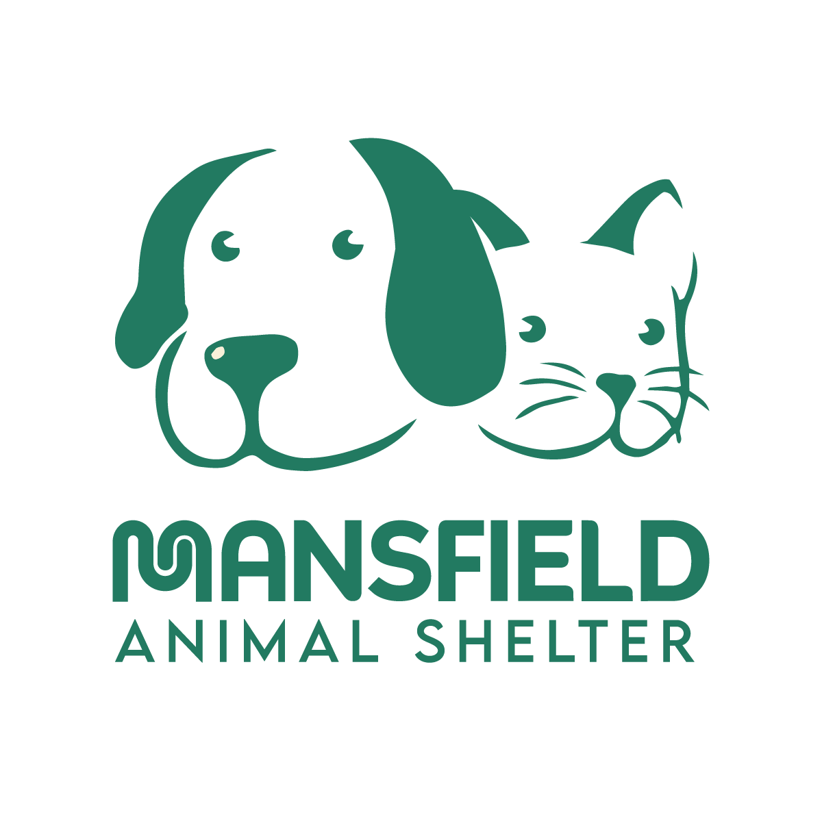
LOGO WITH CUSTOM ILLUSTRATION
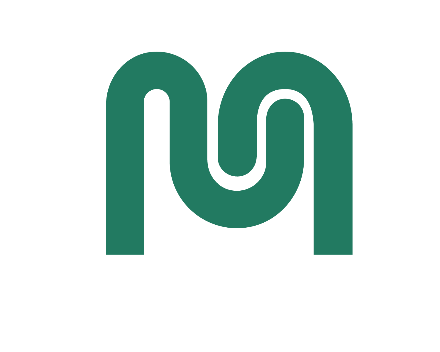
CUSTOMIZED LETTERFORM
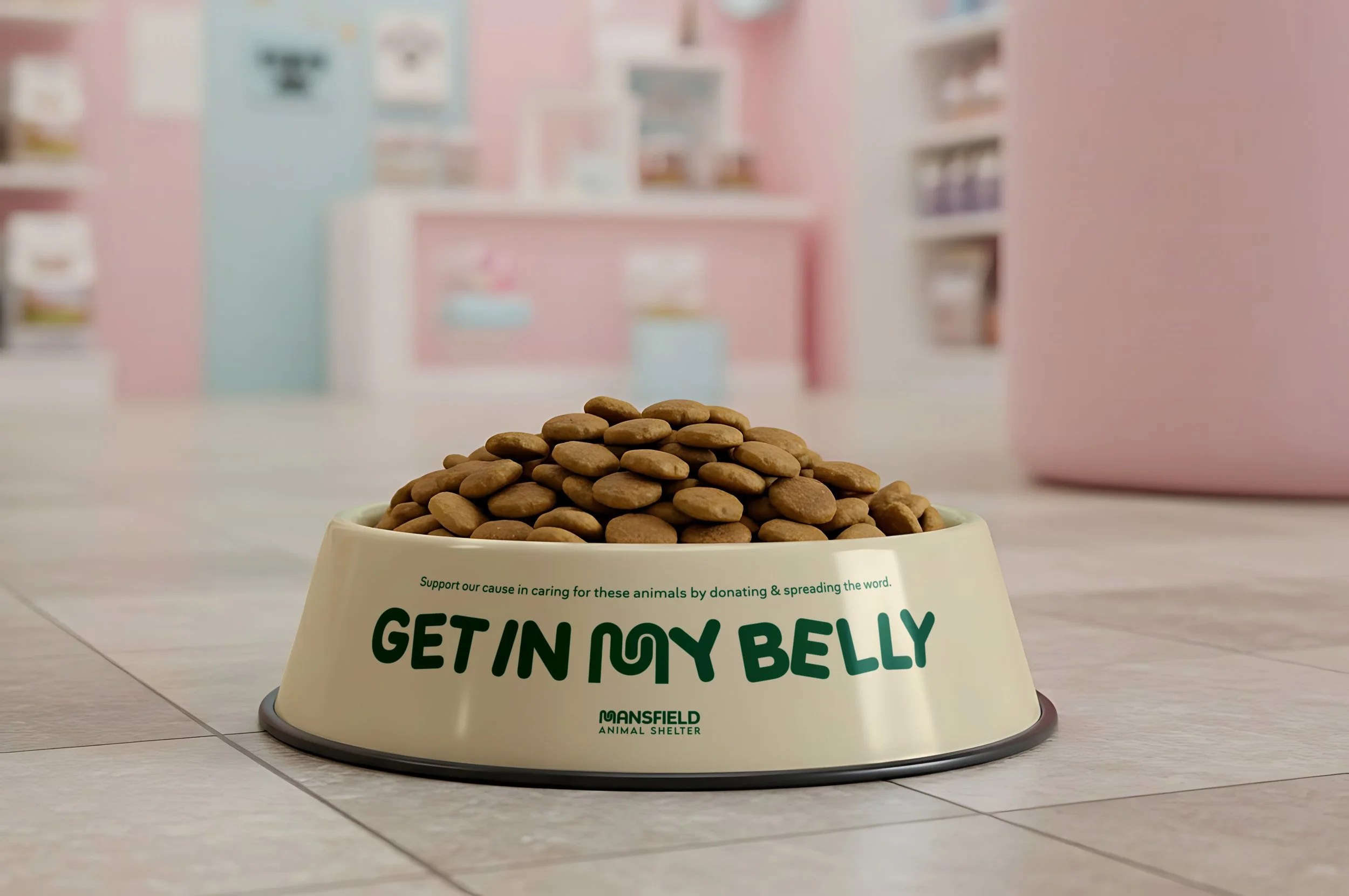
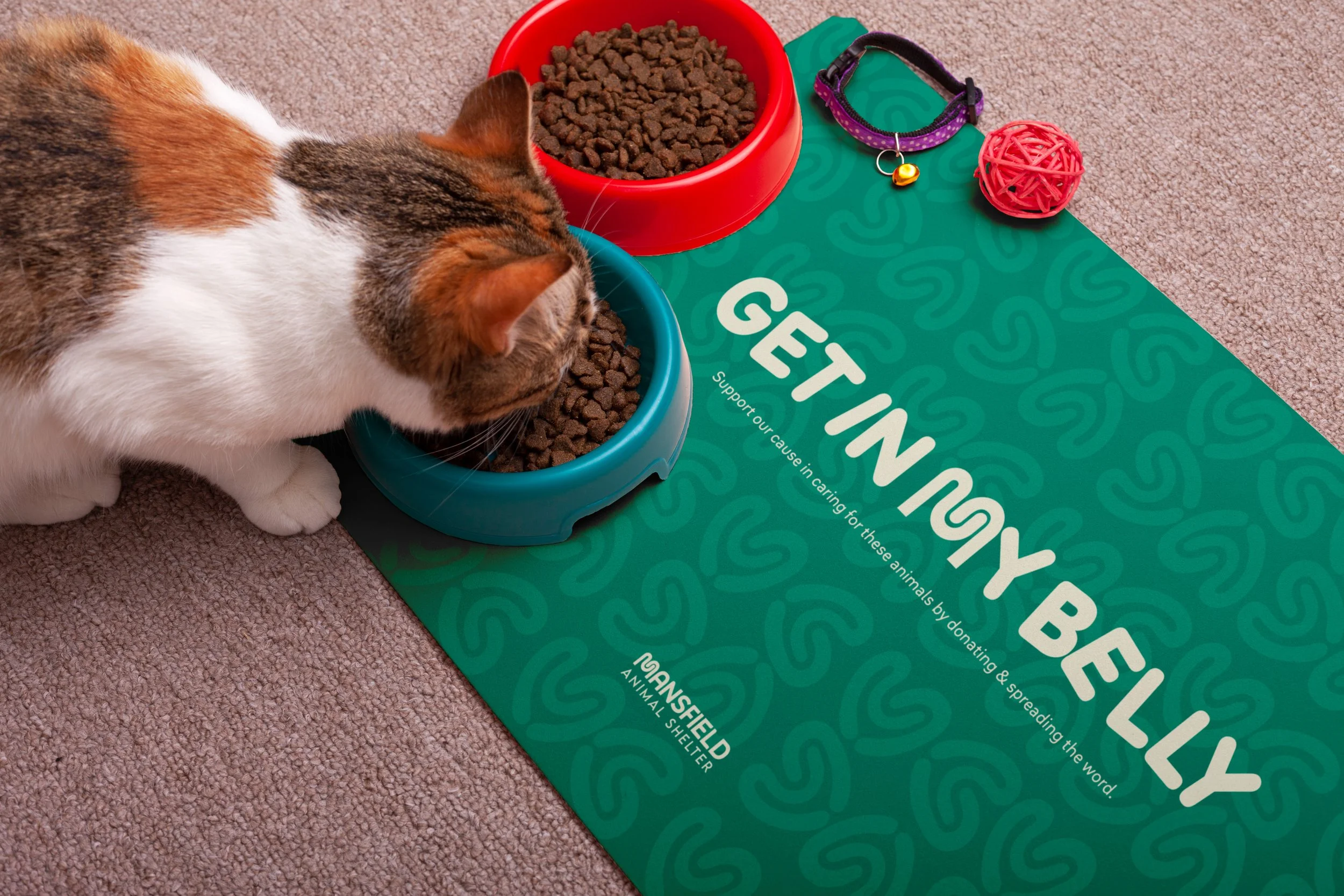
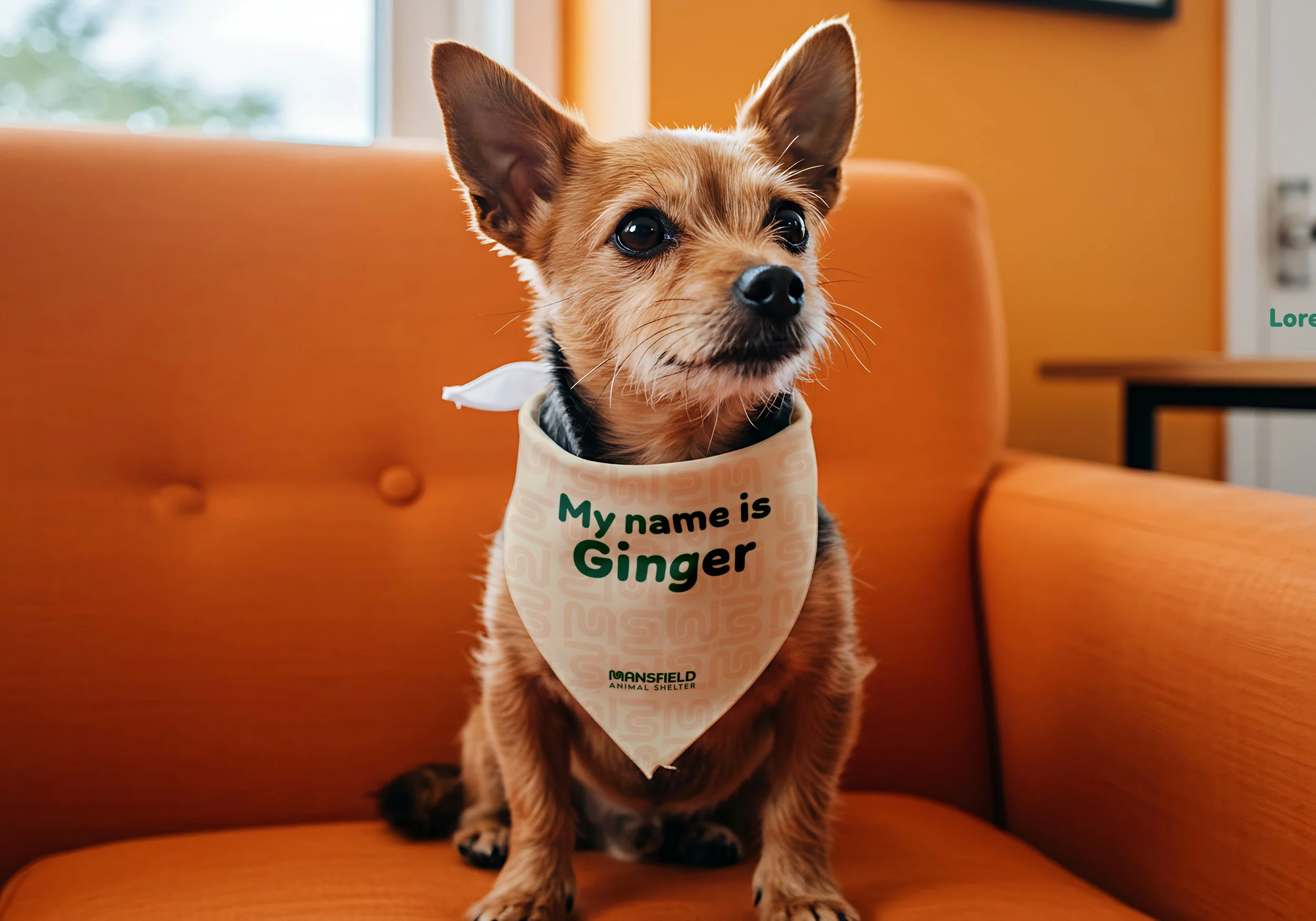
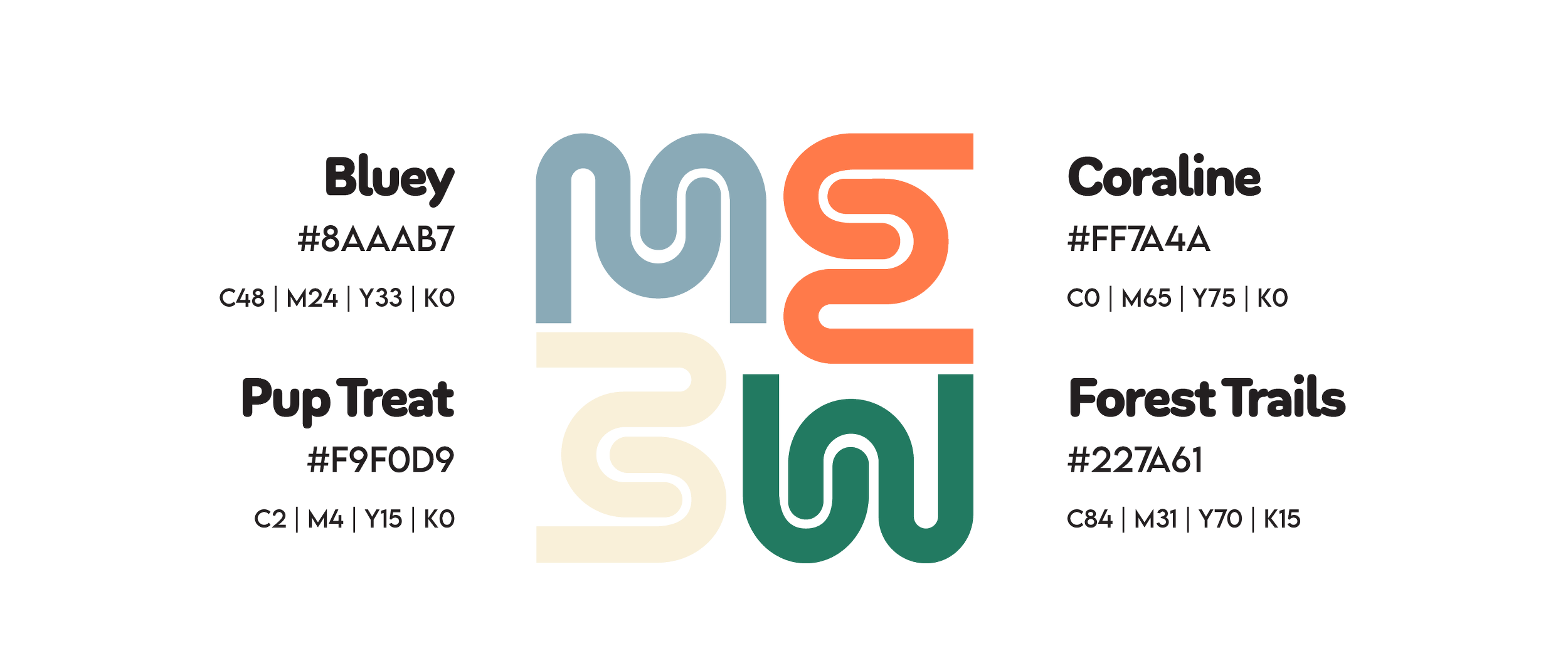
Color Palette
Mansfield’s identity is built on colors: green, black, and white — strong, civic, and authoritative. The right foundation, but not the full story for an animal shelter whose mission is rooted in warmth, hope, and second chances. Instead, I opted into something bright and playful while still maintaining the connection to its own town.
Typography
The typography needed to carry the same warmth and intention as the logo and color palette — soft enough to feel welcoming, structured enough to feel trustworthy.
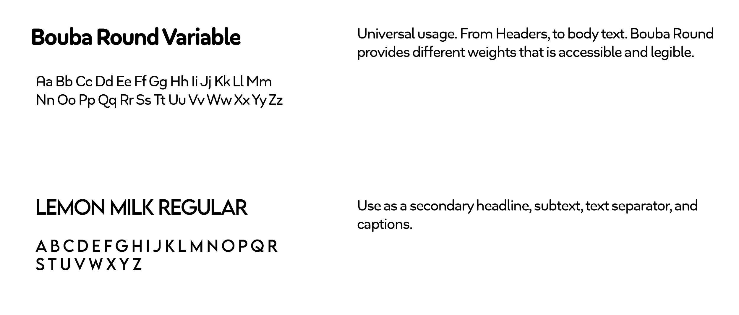
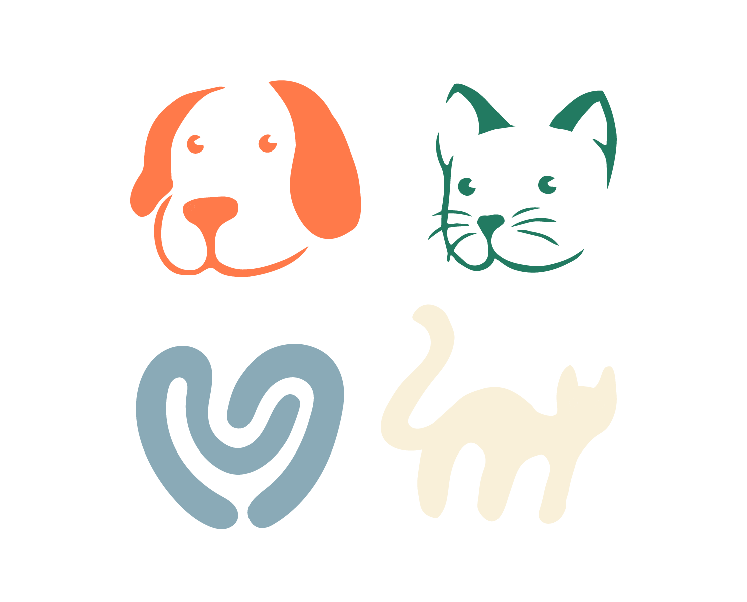
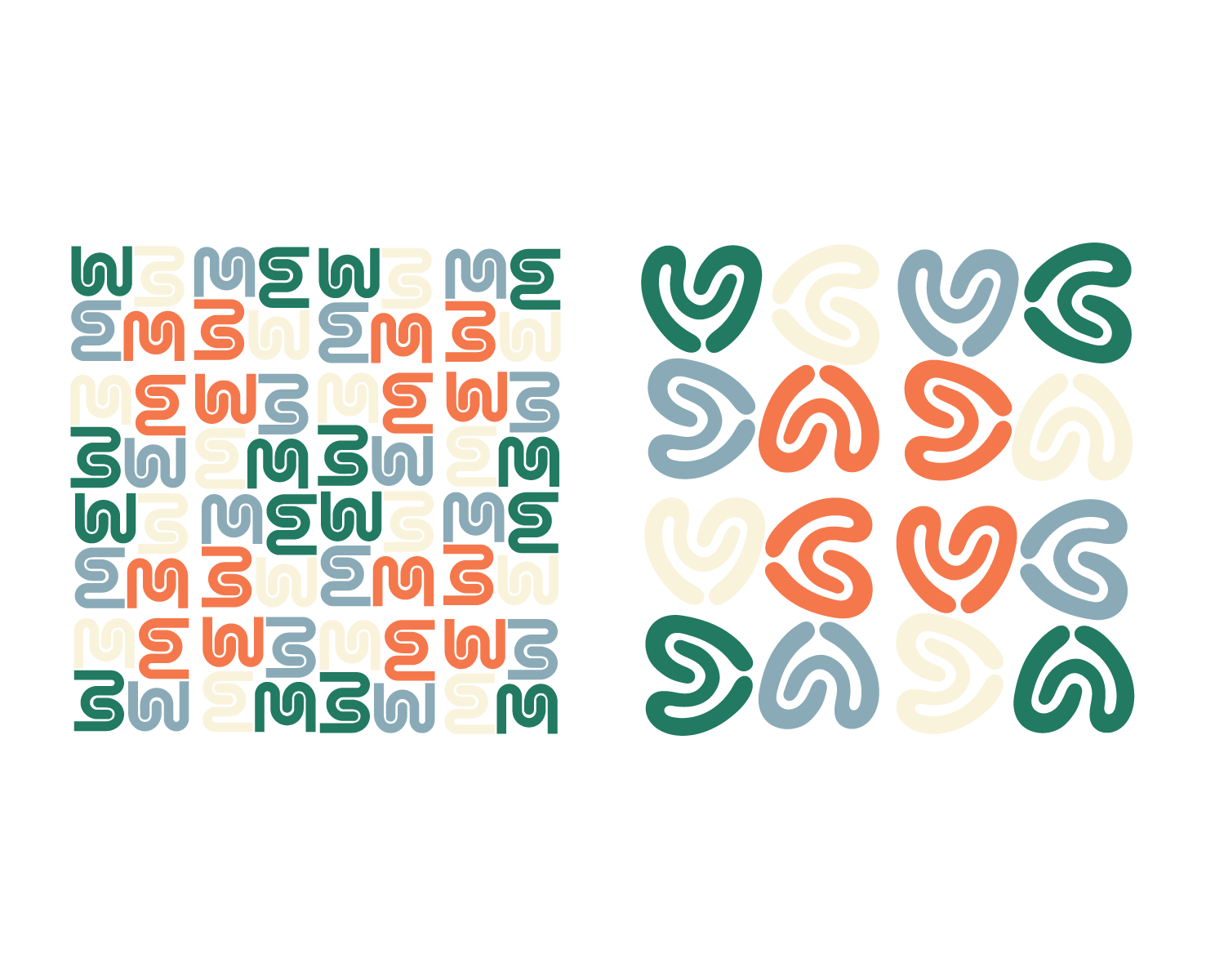
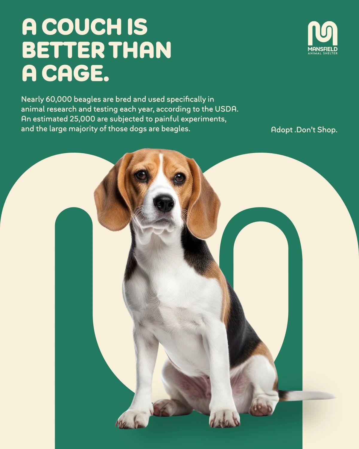
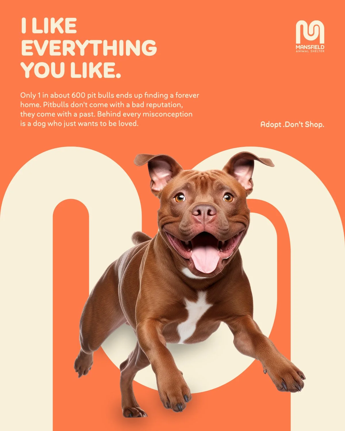
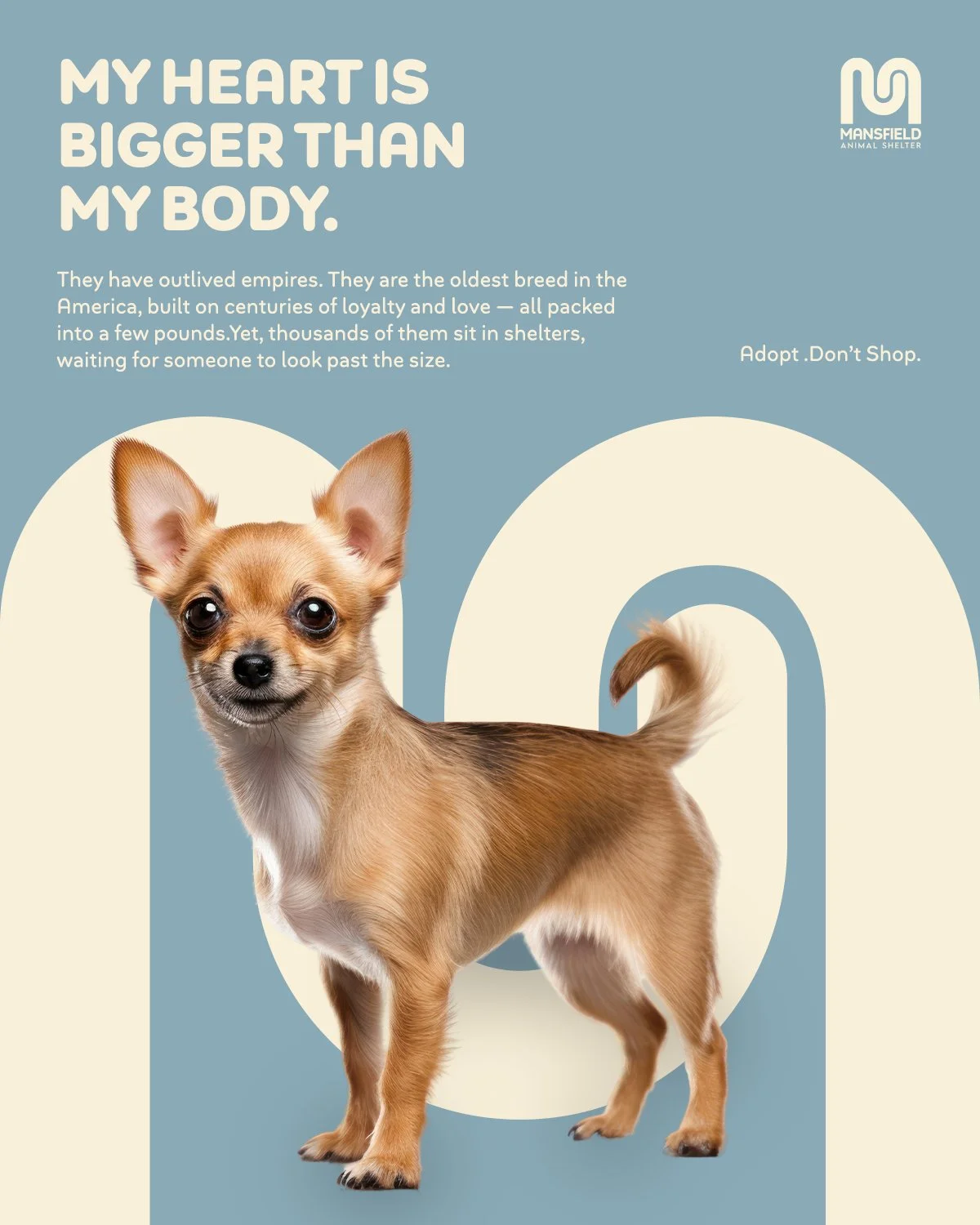
Illustration & Pattern
Illustrated on Procreate and Adobe Illustrator.