BrandingServices
Brand Identity
Roles
Designer
Overview
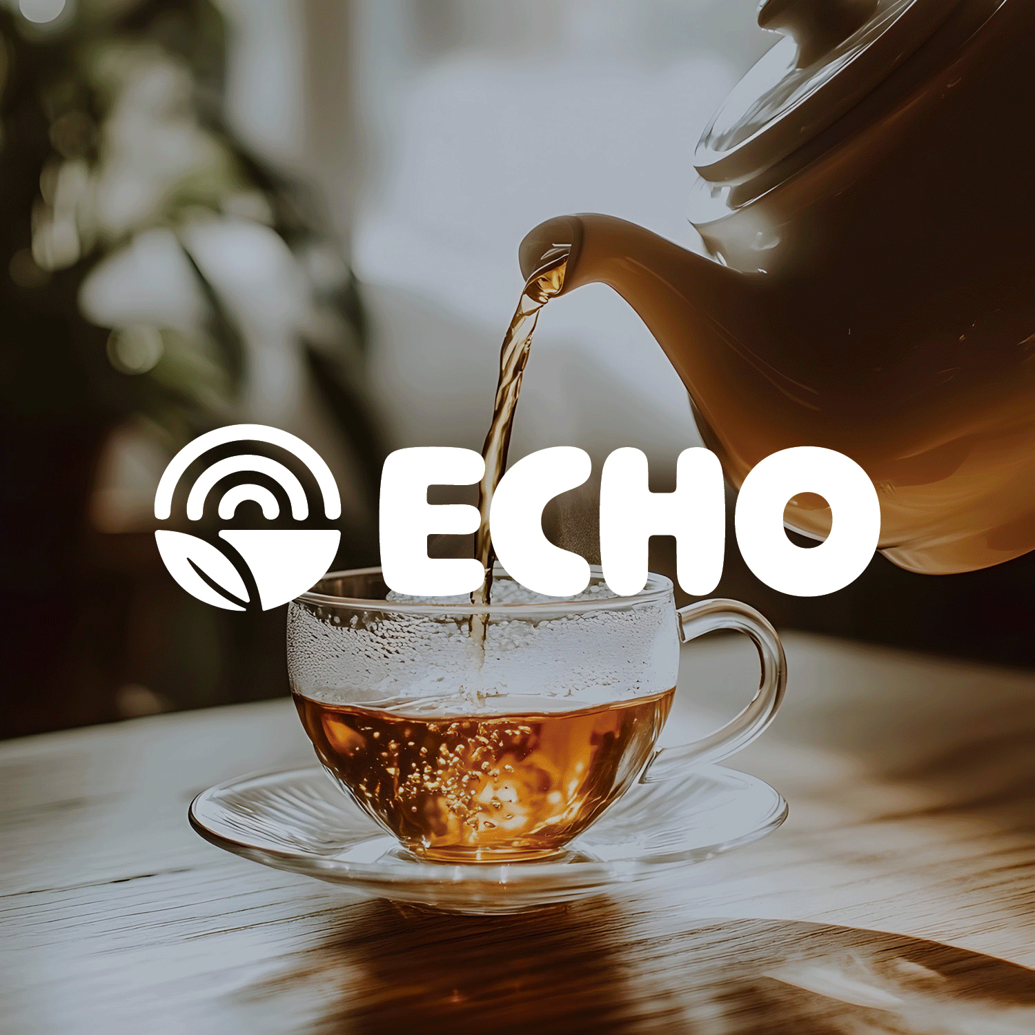
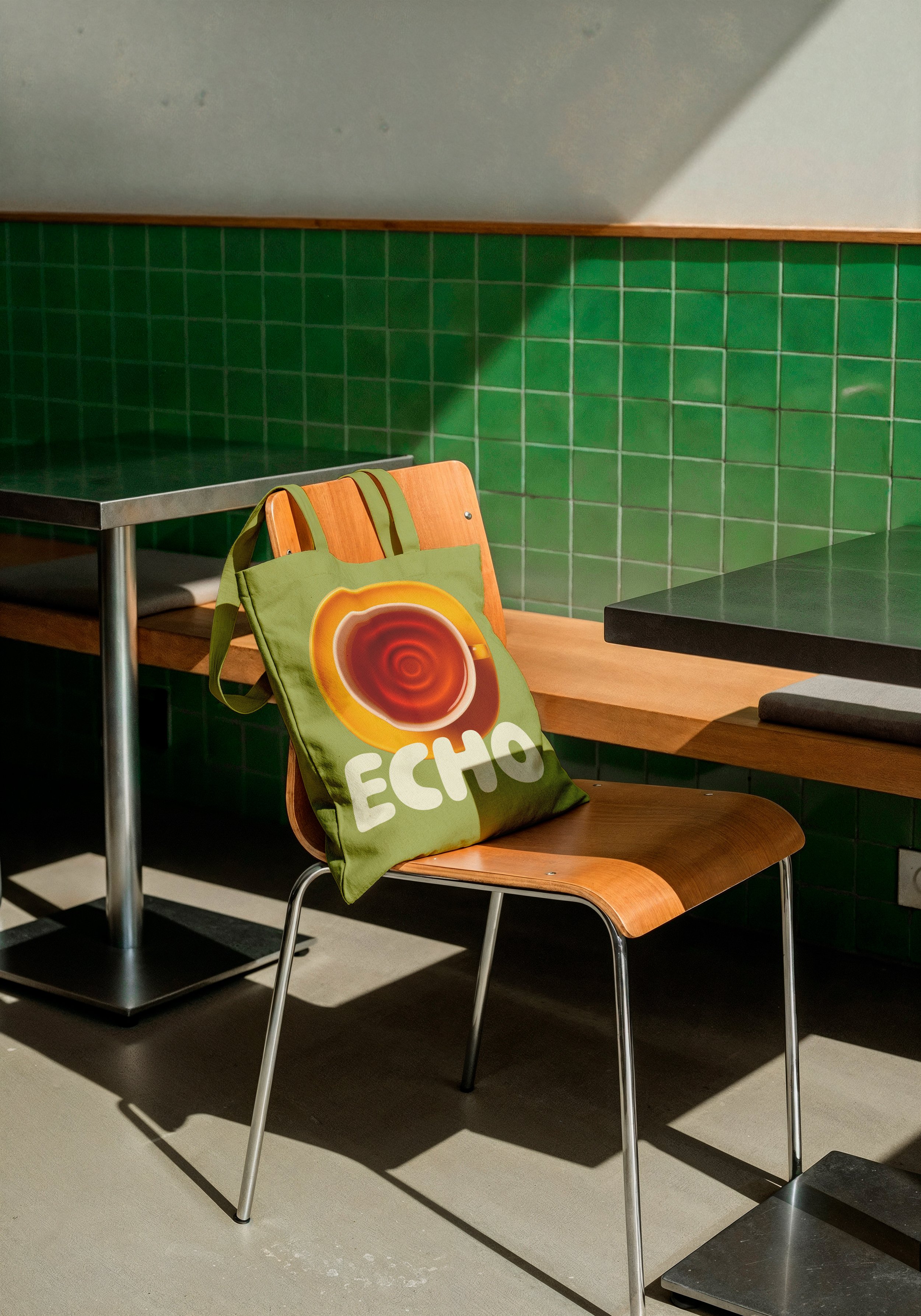
Echo is a dual-concept space where loose-leaf tea culture meets the tactile ritual of vinyl records. The name was chosen deliberately. Sound reverberates. Flavor lingers. Analog experiences stay with you long after you leave. Echo is not a café that happens to sell records or a record shop that happens to serve tea. It is one intentional experience built around slowing down, listening closely, and choosing something by hand.
Applications
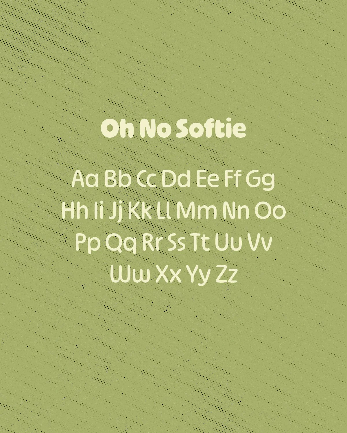
Typography
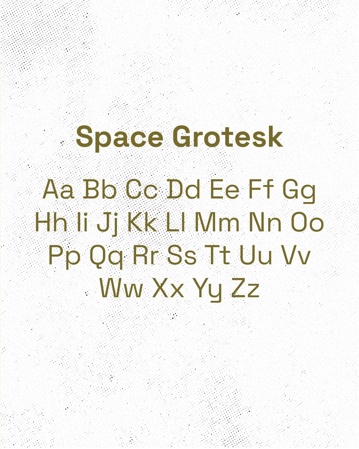
Echo's typographic system pairs Oh No Softie with Space Grotesk. Oh No Softie brings warmth and approachability to the brand's headlines, its rounded forms echoing the organic nature of tea leaves and the softness of an afternoon spent listening. Space Grotesk grounds the system with clarity and precision, used across body text and supporting information. Together they create a voice that feels both inviting and considered.
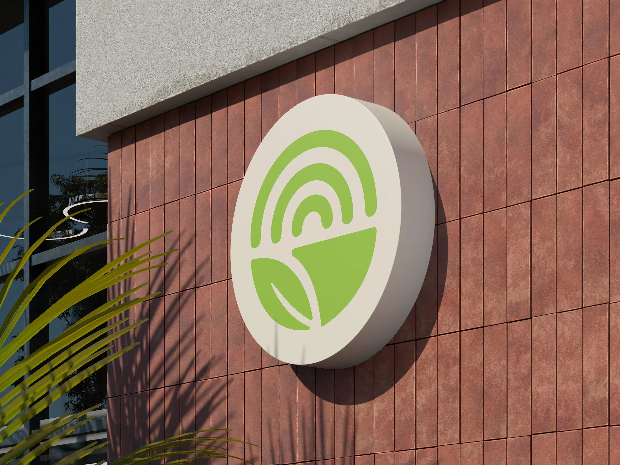
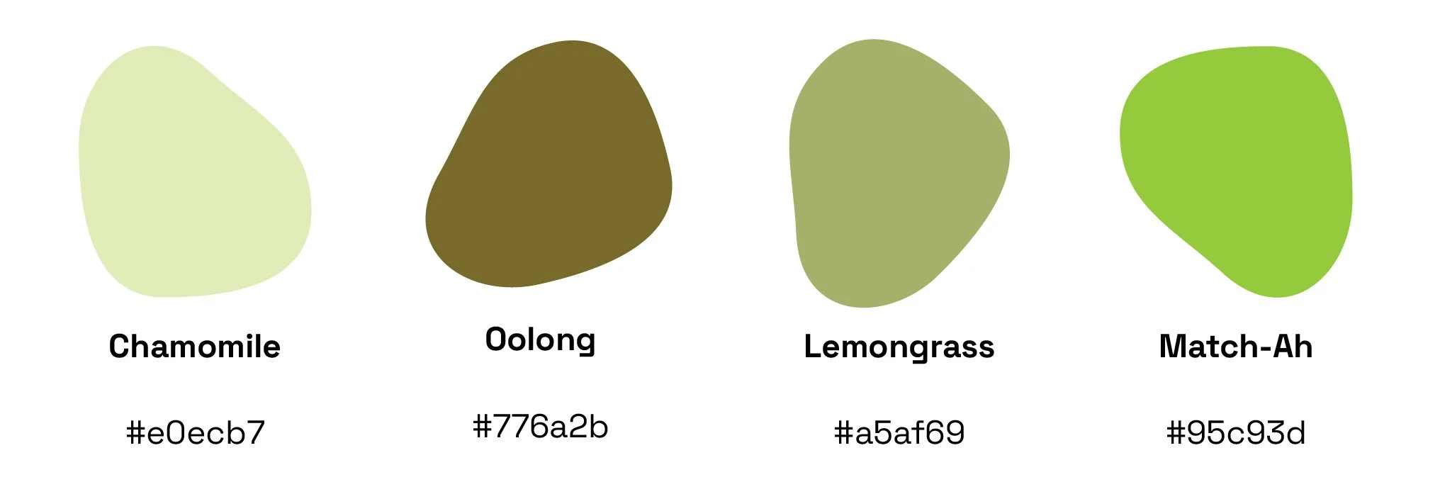
Color Palette + Assets
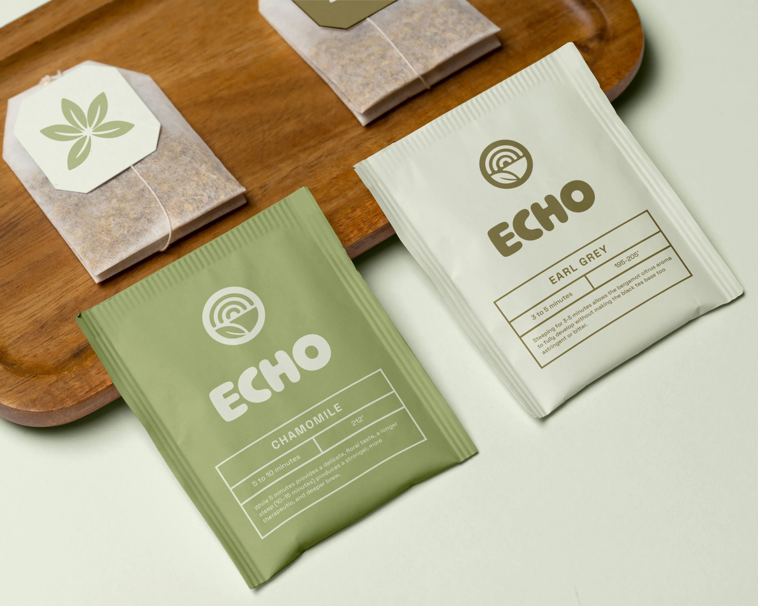
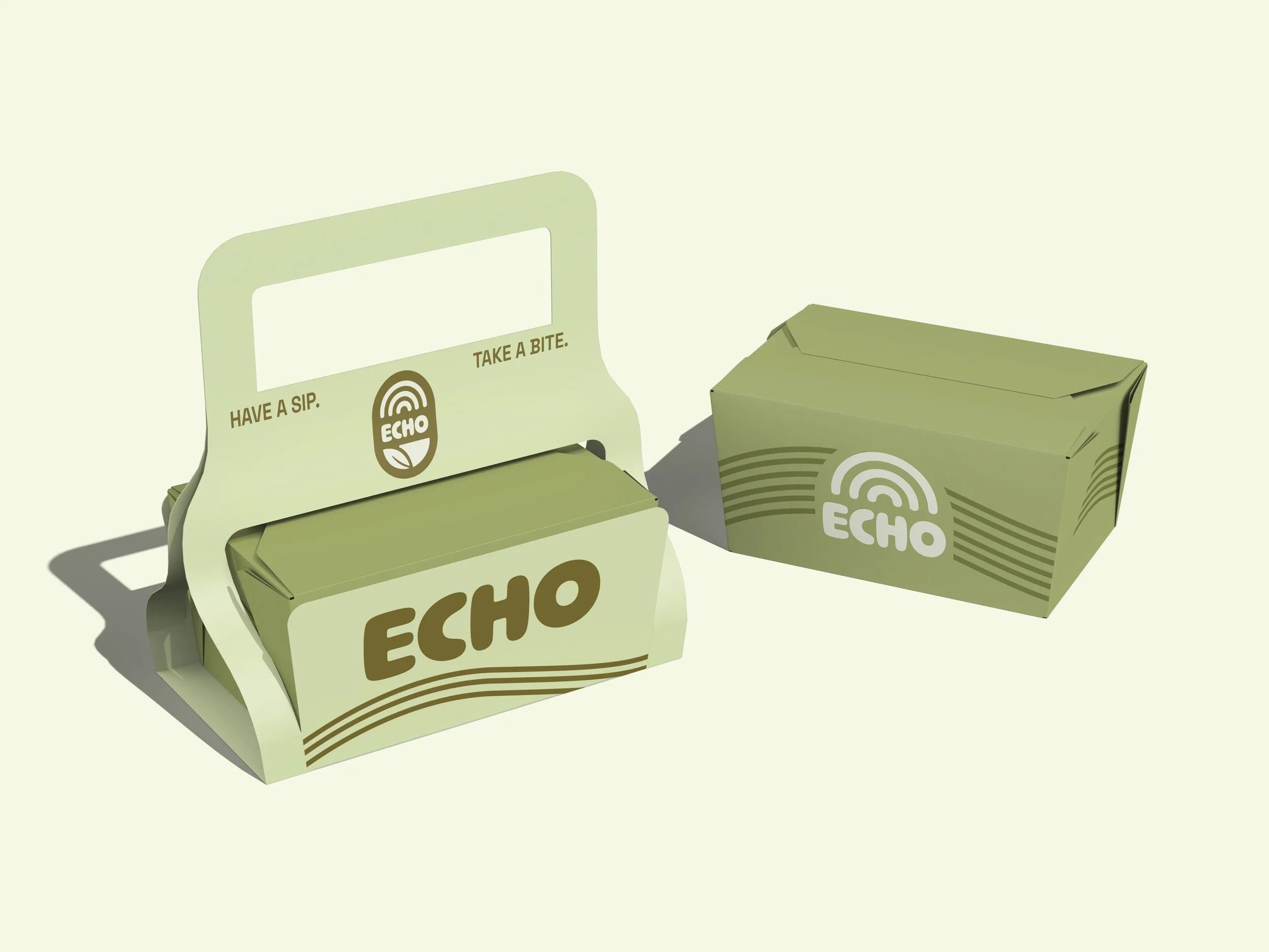
The color palette was drawn directly from the world Echo inhabits. Chamomile, Oolong, Lemongrass, and Match-Ah are not just color names. They are an invitation into the brand's sensibility. Every tone was chosen to feel organic, unhurried, and deeply rooted in the natural world that both tea and music ask you to slow down and appreciate.
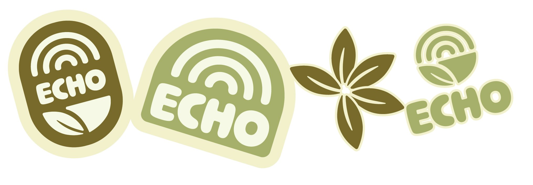
Logo Exploration